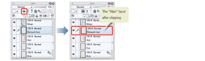
I think this is also part of overthinking things. Something that is clipped also has a child-parent relationship though.
It’s not like anyone ever complained about indentation being a thing in other software. At least, I never read such complaints anywhere. Perhaps there may be a design that could do without indentation, but then you’ll have people (like me) who would like to have indentation. Can’t satisfy both without making either way optional imo.
The way I imagine it, I would get confused with indentation because it will be on top all other indentation are for child items which are placed below. I would think at a glance that the clipped layer that is on top is one level inside or is in a group. If indentation is making the clipped layer stand out then it also makes it mixed with other indented items that are above it which can make it look like it is part of group above it if there is one. How will it look if there is a group with layers, then followed by a indented clipped layer and then the base layer.
May be as you say I am over thinking it. So I’ll stop with this thought.
Why have it there? All those buttons add/ manipulate rows (layers/ masks/ filters).
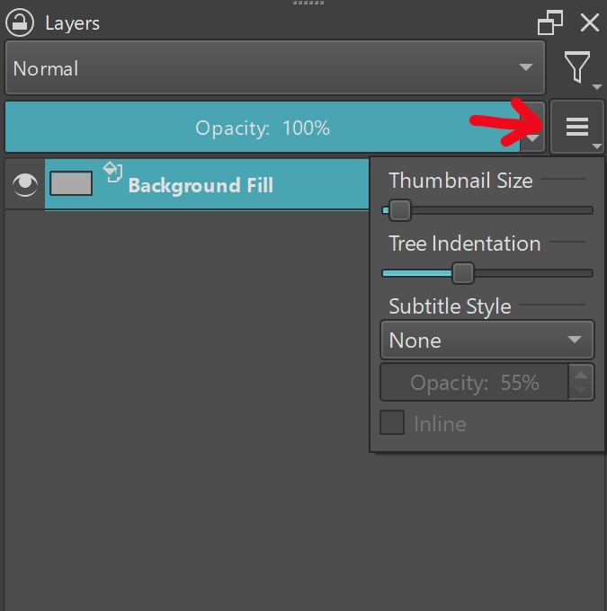
Any changes to the docker itself should be in the docker options imo. Because they change the way the docker is used.
Under tree indentation there can be:
A dropdown called “Clipping mask style” with the options for arrow or indentation
A default clipping mask style: inherit alpha or clipping mask
The latter would be mostly for imports. But could also make it’s way to the user preferences.
Any file that were to use clipping masks would be saved with the clipping mask setting saved, so legacy files will always be read as not having clipping masks. Krita knows what to do when it encounters a file with clipping masks > it is a new version and forward compatible.
I like that so I’m not confused by that at all. But this is how it clicks in my mind. So I’ll leave it at that. Don’t want to make too many posts in a row here to get my point of view across.
I almost never use the docker. Hence, why I don’t think it should be there. I do use layer property and so. I guess it’s a matter of speed vs UI simplication.
They are different approaches, because the indentation is not something exclusive to CSP, it is in several programs, only in PS is where it is not used, that is why I suggested it, just an idea, if you do not think it is discarded, it is not need to use a strong tone…
1 below or All below again ?
1 or the other I mean.
I still prefer tiar and deif_lou proposal.
For the toggle if it was there ,
I think it should switch which would be the first action in a cycle if its a cycle of clicks.
1 below first (clipping mask)
All below first (inherit alpha)
Or just switch what is the preferred action on click, rather than forcing the whole document to change alll its alpha/clip mask that are already in it. because i can see some confusion by someone accidentally click that on a document that get sent to them.
The other proposal to have both icon, and have it remember default, to reduce click - so they all one click action is also interesting , can get busy. Maybe more mockup.
It would not change the whole document, but rather the icons of unset alpha mode. This means if you have already assigned one, it’s not affected. This makes it easier to have a one-click clip mask or alpha inheritance. As for switching, I think cntrl+click should switch and a click alone should enable/disable alpha mode.
Yeah but also not respecting would make just about the same amount of mess (if not more) in the codebase as layer styles, and more messy codebase = more bugs. It sounds like a recipe for a disaster, since Krita is based on the idea that groups are independent.
The more I look at it, the more it seems that users actually don’t want layers, they want graphs… whole node system, with anything linking to anything. Absolute madness. And then people would complain that Krita is not easy for newcommers
I’ve used art programs with a full node tree before. Confusing at first but overwhelmingly powerful.
New users have a hard enough time with Krita, no need to give them an existential crisis when they open the layers docker.
Took me a while to catch up with the thread but i think tiar icons are easier to understand post 93 compared to deif_lou (as i dont really see the need to change the alpha icon) post 114 my only concern of you needing to click the arrow to change being kinda obscure as it just looks like an indicator to me. Also it being all the way to the left very far away from the button to turn on or off
Also reading the previous posts i am a bit lost on this. What do you mean by click and dragging? like drag a layer to another clip it? i am a bit confused
I realy like this suggestion to show. Personally I prefer this sort of indicator than arrows as they look less busy visually and also agree that we should use the same indicator to both modes like tiar suggested. Cause as I see the left indicator is “does it inherit alpha/is a clipping mask” - yes/no to check the type look to the right.
its just easier to notice that there is a clipping mask. yes we have the icons but they stay on the other side after thumbnail and layer name (and sometimes a huge gap), having an indication on the left just makes things easier to see. i dont really see it as over engineering, many other programs use some sort of indicator on the left to denotate a clipping mask. I also dont really see what harm that can do.
One thing we could think is give options for (bar indicator, arrow indicator, no indicator) this way people would all be comfortable. Kinda like we have for subtitle style (in the nightly builds), it could also be a combo box in the hamburger menu. like Hologram suggested in post 126
I also agree with this suggestion. If we are really going with a rotation click to choose the mode a default option is important
Reptorian suggestion is also interesting imo. Having the alpha there though i am not sure if i understood it well enough. from what i understood, you set the alpha mode on the docker button, and the one on the layer is on and off only, with the possibility of using ctrl+click to change it in the layer stack without needing to press the button underneath it.
If thats what you suggest i will just say would be good to just click the button to change the mode (without needing to press the small arrow and selecting a mode) for this i guess the icon would need to change to reflect that.
I also wonder if the non active icon changing would be confusing, cause right now i am imagining this being a global setting so imagine all the non active icons changing. i think it should only change when its set to active. And maybe clicking would activate the alpha/clip on the selected layer.
In the end let me summarize some points that I think are important so far, so things are not super lost on the thread:
Adding different shortcuts for on/off and to change to alternate between the modes of alpha inheritance/cliping mask
These settings being accessible from the python API
There seems to be a division on the type of indicators, so maybe adding 3 options (bar indicator, arrow indicator, no indicator) in the hamburger menu.
There seems to be a division on how to change the modes. Between multiple clicks to cycle between off, clip mask and alpha inheritance; 2 separate buttons for on/off and changing the mode
From my point of view the issue with cycle between the modes with multiple clicks is:
Might be obscure at first
Having to possible do multiple clicks to turn off
Possible solution: be able to turn off by a combination (ctrl or shift click the icon)
Depending on the preferred mode people might need to constantly do 2 clicks to set a clip mask.
Possible solution: be able to set what is the default mode (the first one that is selected once you click the alpha button)
Pros:
Everything in one button?
Possible issues Different buttons for toggle on/off and changing between the modes
Possible fragmentation of the function might cause confusion (basically not knowing where to change the mode). Or being too distant of each other might increase time to quickly turn on and change mode
Possible solution: be able to change the mode by a combination (ctrl or shift click the icon that turns the alpha on and off)
Trouble knowing where to put the 2 options (different opinions on the matter)
Pros:
Avoids unwanted actions (turning off when actually wanted to change the mode and vice versa)
More control on your actions
Possibility to work with a preferred mode is easier, just choose the mode you want and stick to that (also possible with the cycle if the default option is implemented)
I obviously like more the 2 different buttons. but if the implementation of being able to turn on and off with a click combination and to set a default mode are implemented i guess i could be ok with it however to me the cycle feels like you would need a lot more on top to make it more usable than just having 2 buttons.
I think there could be a compromise between 2 buttons, and the switch approach. One could have an additional button next to clip/alpha indicator to switch. In additional, the layer docker can be used to indicate preference.
I would definitely not want an additional button if it makes the layer docker wider (it already is pretty wide).
I think it makes more sense to use a modifier click on the inherit alpha button. And set the default mode so you can drag clipping masks.
That said how often will people actually switch between clipping masks and inherit alpha. If you have two very clear methods of activating one or the other, you won’t. You will probably activate one or the other based on your particular workflow and layer structure. Switching is likely to mess this up. You cannot have both, unless you only have one layer and one mask layer.
I can see a lot of user questions emerging when they accidentally switched after a miss-click. At least, when the implementation isn’t obvious. I think there should at least be a tooltip that mentions the switching.
Maybe we should start thinking of putting the icons on a toolbar, like csp. Imagine in the future the reference layer option (or other) is added, it would be another button to put there…
You are referring to the switch inherit alpha/ clipping mask button, right? That would make more sense than in the layers docker. For a good default location, I can even argue it should be in the Layer > Convert menu, since I imagine it to be used very rarely. And it essentially converts a layer in a linguistic sense.
It could be called Convert to inherit alpha/ clipping mask, depending on the layer that is selected.
People who would use it more often would then add it to their toolbar as a button.
Sorry, I don’t quite get what you are referring to with this.
I’m meant all the buttons on the right of the layers. Maybe it’s better to put them in a toolbar, like csp:
With reference layer I mean the ability of explicitly marking a layer as reference, to later use them as reference in tools like the fill tool (instesd of using color labels). In csp is the button with the lighthouse icon.
The downside is that you have to select the layer before changing one of those properties. Also it would have to be some indications in the layer row so that one knows what is activated without selecting.
One thing is clear, if some new options need to be implemented they need to be placed somewhere, and people don’t want the layer space to be reduced by buttons, so I don’t know.
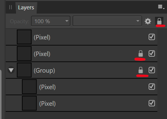
Ah, okay, right. Affinity has the buttons there as well. That would be fine by me on the condition that if any layers have inherit alpha, clipping masks or when they are locked, the icon is displayed. Meaning that by default, the layer tree is clean and that any exceptions are displayed.
This makes it easy to identify layer states on quick glance. In my opinion it’s the best trade-of between usability and visibility. It avoids UI clutter, yet displays that which is necessary. Note that the lock icon is a button that can be used to unlock a layer, so you don’t have to reach to the top if you want to unlock some layers.
E: The checkbox is for visibility and it looks bad. it should actually be on the left in Affinity lol.

 ?
?