Random feedback : using only two screentones filter masks on a layer on an A4 canvas @500 ppi causes a serious performance drops while painting. It’s such that you’d best turn off the visibility of the filters to paint at normal speed. Why is it so slow ?
I’m saying this because of the workaround which I tested. It does the job, but painting is really slow with the filter mask visible.
I guess you mean using the halftone filter with the screentone generator?
Can you post an image where your layer stack can be seen clearly?
And can you show the screentone generator parameters you are using?
Also, are you using Krita 5 with the last modifications to the screentone generator or a older one?
Also, what brush and brush size are you using?
Short answer to you question: the halftone filter used as a filter mask/layer has to be applied in real time every time there is a change in the parent layer (filter mask) or in one of the layers below (filter layer). That the reason.
If you compare this filter with others, like gaussian blur, you’ll see it’s faster, and this is not a problem specific to the halftone filter, but to every filter used in this way.
Despite of that, when you are painting the filter has to be recomputed only in the region that was changed. When you change a parameter in the filter, then it is recomputed for all the image. I created an A4, 600dpi document with 2 halftone filter masks, and can paint. It is not super fast, but I can draw with a 1000px airbrush and see results pretty quick for the size:
2 Likes
Looks very usable for post processing with such a big brush. Looks Amazing.
Well, the reason is why that is slow is what I explained earlier, the filter has to be computed every time you paint below, twice (because you have 2 layers). So if it is unusable you better hide them while painting and adjust the filters as a postprocesing step.
That’s what I do right now to save time.
Although the “reflect opacity” option could compute things without forcing the use of two filters and thus give a much faster result. I know it’s not available yet and am doing as you suggested in the meantime.
Greetings @Deif_Lou . Hope you’re well.
Alright, thank you for the “align to pixel grid” feature. It significantly improves consistency.
I just want to give my final verdict after playing with it for some time :
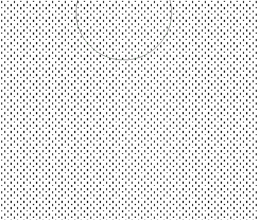
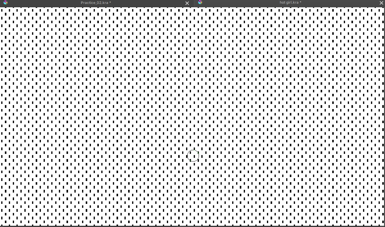
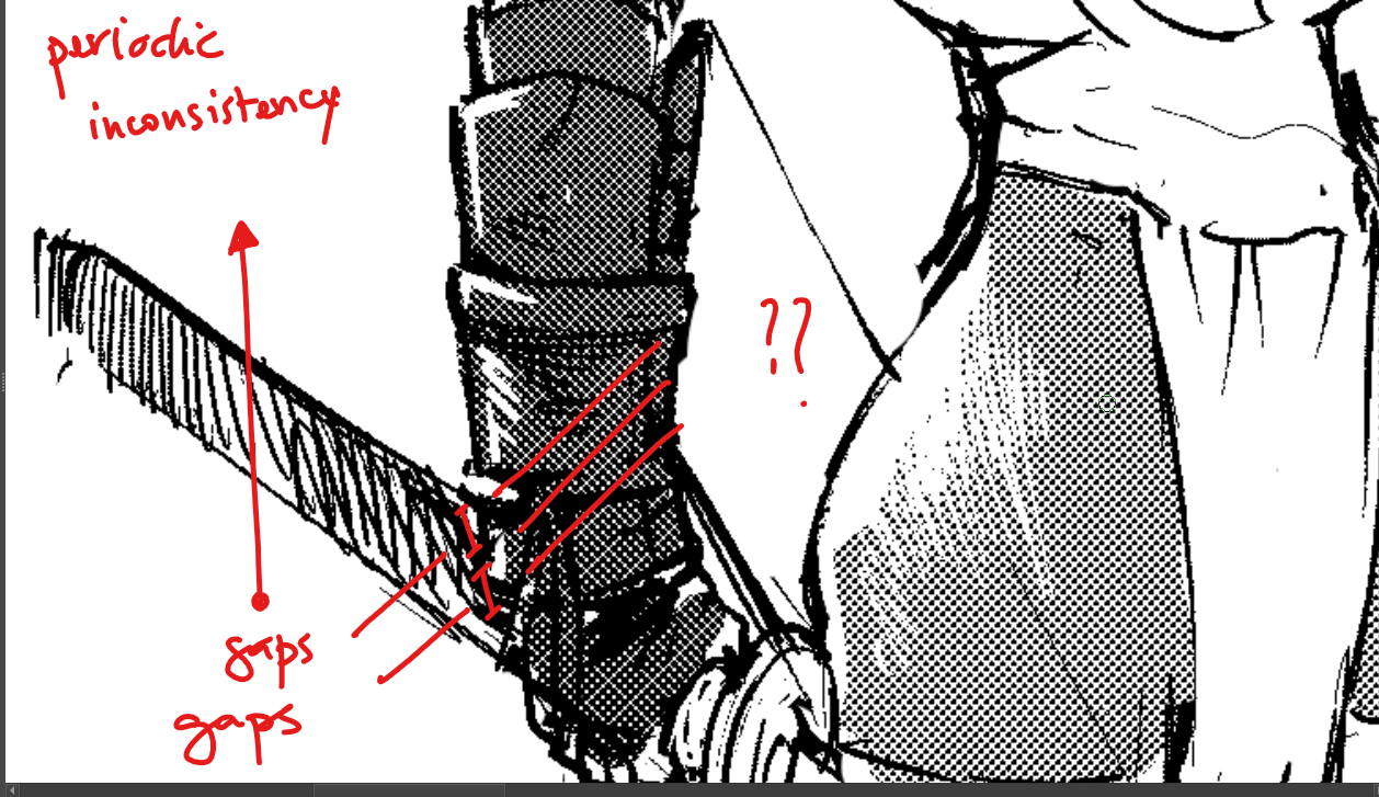
So… there are still… a tiny bit more inconsistencies. And they re noticeable mostly when we use low scale dots. See the periodic white lines appearing in the below picture.

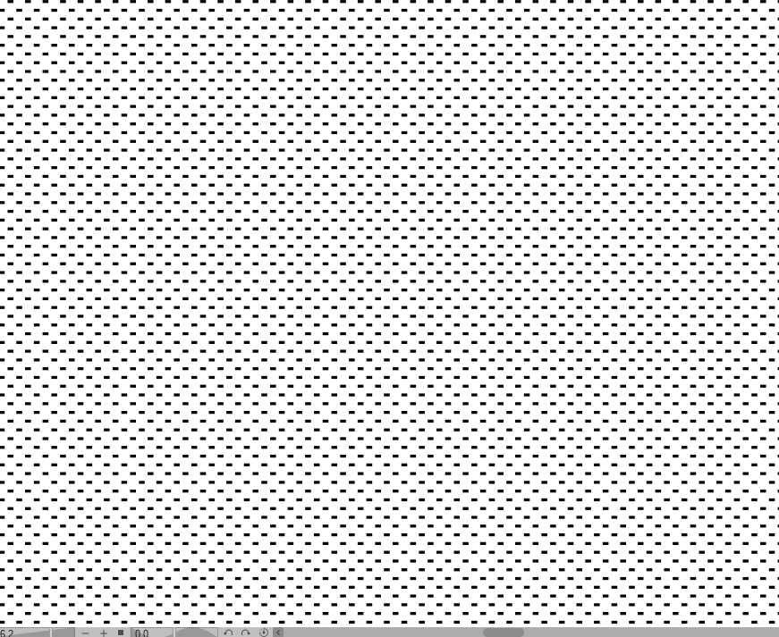
See the periodic shapes appearing there too. The density/value in this area is uniform in principle so it should also be reflected in the screentone. But…

Anyway. Lastly, here’s a comparison, presumably with the same settings.
So we have :
Density/value : 10 ( 0 means full white, 100 means full black )
DPI : 360
Frequency in lpi : 75
Angle : 45°
Krita :
CSP :
In other words, the moiré effect probability has been greatly reduced in Krita but not nullified yet.
So… I’ll be hoping for a future update, when you’re inspired again. ![]()
Still, thank you for making it more consistent. With higher scale, the issue is minor and not really noticeable. It’s still there but, harder to notice. So with the current update, it’s already much better.
Now, all of this is valid only with maximum hardness.
The screentone is impeccable with “align to pixel grid” ticked on, if the hardness is lower, around 80-85%. There’d be anti-aliasing with this tho.
@Deif_Lou
When I change the resolution to 500 ppi in Krita with the same settings, it’s
literally perfect. ![]()
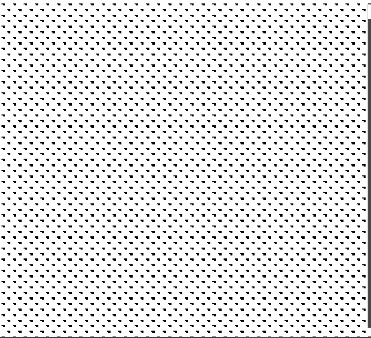
All the dots display in the exact same way…
You should evaluate the results with zooms multiple of 100%, otherwise the shapes can vary. Also do that when taking screenshots.
- In the first picture it seems that those lines are just the space between dots. What is that you don’t like or think is wrong?
- In the second image, well, you can try to set up the brightness a bit and see is that upper right pixel in those dots disappear. This screentone generator is completelly procedural, so cases like these can appear.
That the color is uniform doesn’t mean that the screentone dots should be uniform. The rationale is this: if you have an 8 bit rgb image you can have 256 grays. But if you have a, say, 5x5px screentone grid, each cell (dot) only can represent 25 values of gray, corresponding to the different combinations you can turn on/off the pixels in that cell. To give the illusion of more tones the concept of macrocell is used. This treats a group of contiguous cells as a unit. Those cells in the macrocell can have slightly different shapes, so as a whole they can represent more tones, and it is the macrocell that is repeated. For example a macrocell of 2x1 of 5x5px cells would have 10x5 px so in principle 50 different tones could be represented and not 25.
I have to say that csp also does that, maybe in a different way. - Same in the 3th image, the comparison, try 89% brightness instead of 90% and if you want the same orientation as csp (which is something arbitrary), use 135 degrees for the rotation.
Okay.
So… In the 1st picture, the only thing I don’t like, are the periodic white lines or rather white spaces.
Technically, it’s fine that the white space appear, but, it will look better if they were more consistent/uniform. A minor thing really.
I’ll do as suggested for the workarounds.
Other than all this… well… Surprisingly… I found an almost perfect way to replicate the noise
toning I spoke about before. ![]()
A workaround was to simply use pattern toning with a noise texture.
Here’s the result :
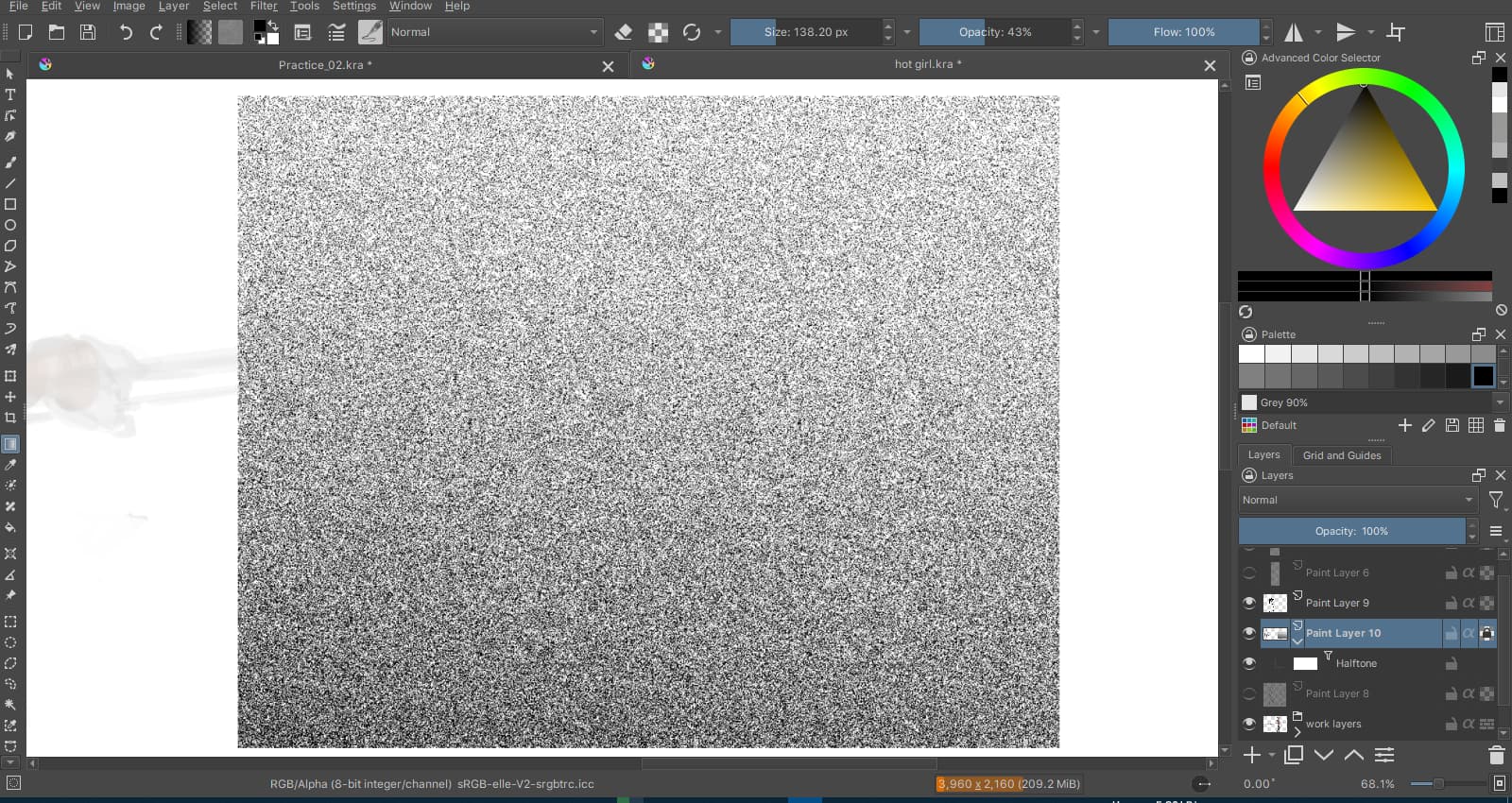
Lots of interesting results can be achieved with this one.
The fact that it’s available in Krita is a blessing.
@Deif_Lou
Rather than saying what’s wrong, I’d say that there’s still a tiny gap for improvement.
If the size is very very small, it should be limited to either invisible dots, or one dot per cell, separated by perfectly consistent white space between every two dots, vertically and horizontally.
I have tried to push the small size of the toning in CSP.
Since the max frequency is 85 lpi, I diminished the document dpi.
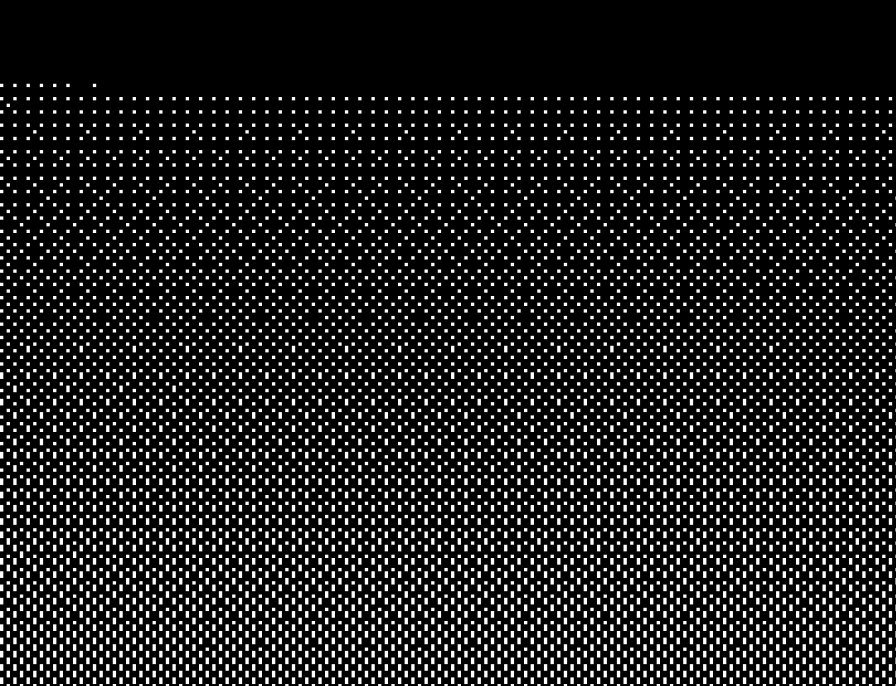
Here’s a preview on an A4, 128dpi :
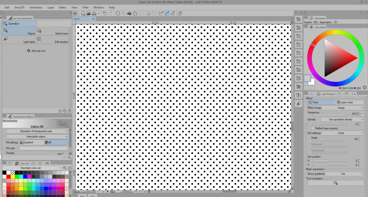
CSP won’t display screentone tinier than this.
I diminished dpi up to 16 and still got the same result with the toning.
This leaves me with the hypothesis according to which, every cell has a minimal size of
3x3 pixels. With the dot displayed at the center of each cell.
Apparently, CSP displays things so that, every dot has exactly the same amount of allocated pixel grids to be displayed. This might explains why everything is super consistent.
Now, how to handle this, I have no idea.
Just make patterns with it and paint it out then, that will be consistent always.
@novames00 you can achieve that result in the screenshot by finetuning the brightness value.
As I said you need the use of a macrocell when using small size cells to achieve the full range of tones (256) when the document is displayed at 100%. This means that the dots in the macrocell can vary a bit pixelwise, although they are equal across macrocells, csp does that as well. For example if you want to have 3x3px cells and you want every dot to look the same no matther the brightness value, you can only represent 9 different gray tones.
Having slightly different values for the dots allows to achieve more tones. But you can always find a value for the brightness that makes the dots look the same. Just set an aproximate value with the slider and then finetune it, with decimals if necessary.
The use of patterns gives by default inconsistent results because, with patterns, things are not aligned to the pixel grid. At least, that’s how Deif Lou’s halftone generator behaves currently with the use of patterns.
With the default Krita halftone brushes, the halftone pattern is consistent and aligned to the pixel grid, but the problem with the brushes, is the control of the value and frequency. Customization is limited if you just use halftone brushes.
In the end, the pattern generator is great but best used with natural textures or noise rather than halftone dots.
well of course that is why I suggest you using paterns on the brush. the filter is dynamic you will probably never have all cases pixel perfect.
yes. that is why it is pixel perfect.
you can just make a post effect and call it a day and have it fit correctly.
I agree with the looks of the dots. Definitely possible to obtain one pixel dots in cells. It’s just that no matter what, the spacing is inconsistent when the scale is this low. The brightness doesn’t help much. It doesn’t really removes the inconsistency with the finetuning. If it does, then it’s noticeable for a limited value range only.
Doing as you suggested, I obtained this for 10% gray/density.
It’s perfectly consistent.
Buuut… the inconsistency remains in darker values with the settings I have :
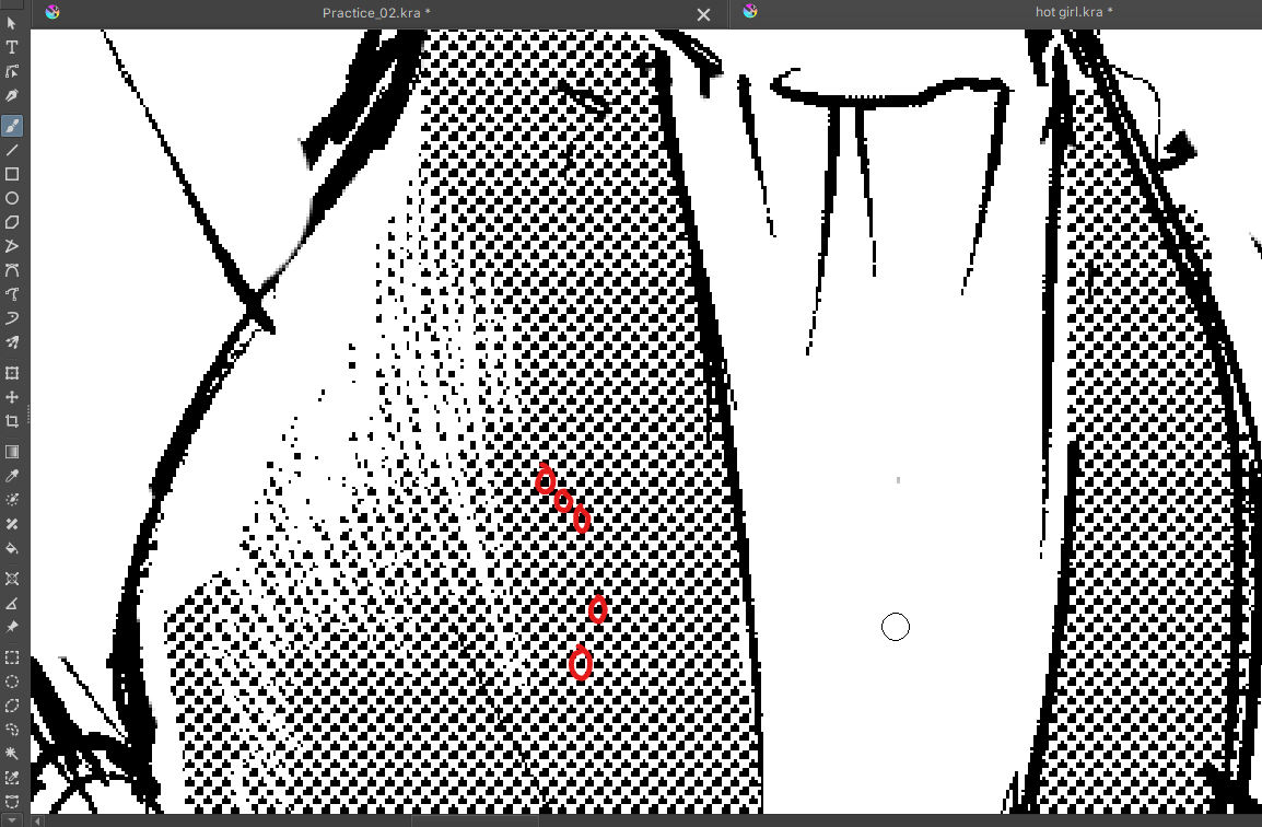
Settings applied : Brightness = 49.46%, dpi = 360, frequency = 85, angle = 45°,
aligned to every 1 cell both vertically and horizontally.
I also wanted to say, that representing these 9 gray tones only, is not an issue with a 3x3 pixels grid. It’s a choice that can be considered as a kind of posterizing effect, to make sure that all dots strictly display uniformly for a given value. These 9 gray values + b/w give 11 values and it’s quite rich already and works well for a grayscale painting or photo with halftones.
Really, the difference is only noticeable at the scale of a single pixel square. That’s just very negligible with a print of 300-600 ppi.
But anyway…
I admit that if we think well, more values result in what’s currently happening with the halftone dots. The few inconsistencies are required to represent more gray values. Still the thing is mostly : CSP does it too but differently. Is it convincing enough to encourage having the same result in Krita too ? I don’t know.
Though, I think that clearly, the result is better in CSP if we compare the following two :
CSP :
Krita :
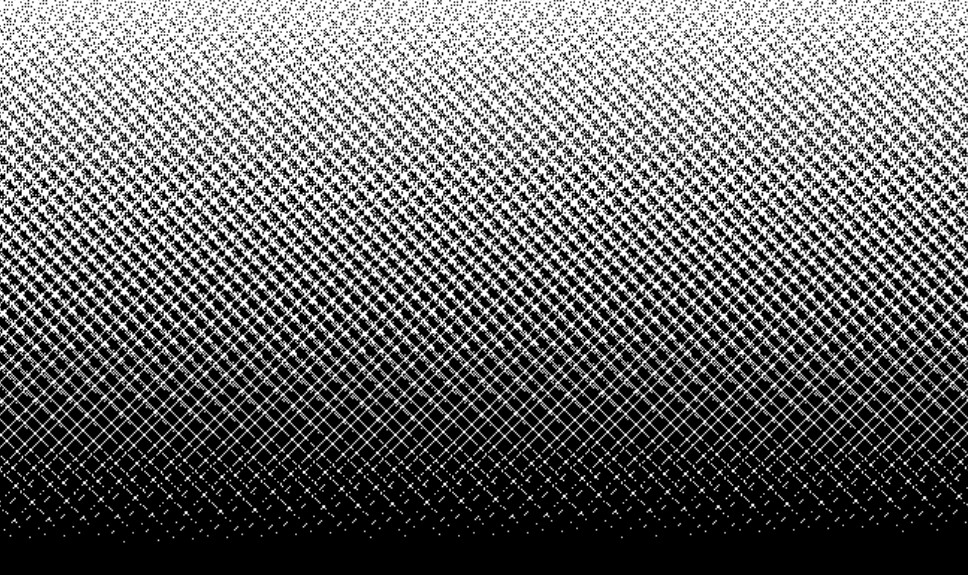
Low scale halftone rendering with a gradient is applied there.
Settings : frequency = 85 lpi, angle = 45°, dpi = 128
Finetuning again will simply make things a bit cumbersome if one needs perfectly consistent halftone dots. Anyway.
As you can see, CSP prefers to renders a nice dithered gradient and there are no intruding white lines like in the case of Krita’s halftone generator.
Basically there’s a moiré effect caused by the low scale. Except that, CSP’s halftone renderer was designed to avoid these moiré effects in almost all circumstances.
Well, that would be it all. That would be the part that needs improvement. I won’t say that it’s wrongly done because it’s not.
Using a 128dpi with 85lpi will give you ~1.5px wide cells, which is unusable for the screentone as you can see in the case of krita. Clearly csp is not rendering the exact thing, and I’m guessing that if you slide down the frequency slider you will see the same result until you reach 40lpi or less, which will tell that csp can not render that combination of dpi/lpi (in esence because it makes no sense to begin with), and chooses behind the curtains the minimum values for the parameters it can render.
I can take a look at the lines issue and see if it can be improved.
1 Like
uhmm this sounds like a 2**n issue.
why is there a 45º rotation though on these tests? 45 sounds like a dangerous value. I never felt qt to be very good rotating I think because of the pixel offset it has.
CSP is not perfect it is creating inconsistencies as you can see.
You will never have anything decent with such a rotation and that is clear from the get go.
I do get the feeling when it is 45 there is one line every other 5 lines or so, that it jumps a beat.
@Deif_Lou
would it not be better to make this more like a pixel perfect checkerboard, and from each unit try to repeat the same shape made by the projection of the shape in pixels. So considering the scale it would alternate to different rotations steps because it could not go pass by every value considering the pixel size. So if your on a 3x3 tile you could not rotate it 10degrees but if you had a 15x15 maybe you could. So if you rotated the checkerboard 45 degrees you would have a fixed to pixel rotation before the array was made. and 45 in pixels would fit consistently with itself and 45 would be accessible to any size. Also probably you would have to make tiles using only even numbers due to symmetry. To summarize make the pixel representation more important than the array of shapes created and flatten to pixels. Every test I made with angle equal zero had super consistent values but if I did any rotation every thing would wobble and shift or jump a step every so often. I know it would probably be and entirely different filter though ‘~’
My thought is that maybe 45 degrees is not precise enough for some reason.
I am still of the opinion that using patterns here is the most sure and safe method to go about this all.
The problem comparing those two images is that even if the parameters entered in the apps are the same or similar, csp is not really using internally 85lpi. As said earlier by @novames00 :
So the same lpi should be used in krita if you want the same results. The generator doesn’t impose any maximum lpi, but the results can look bad if the resulting cell size is less than 3px.
The rotation also makes things harder, but it should look decent. Maybe those lines appear because of the order in which the pixels are “light up”. I’ll take a look. Keep in mind that this generator is procedural, the image is computed on the fly. Csp may be using predefined templates or look up tables, finetuned for certain cases.
3 Likes