Selection Action Bar

It would be nice if, whenever a user creates a new selection mask, there would also be an on-canvas bar with common selection-related actions, somewhere below the selection mask. Like the assistants bar, it should probably only be shown when selection tools are activated. Ideally, it would also be configurable like a typical toolbar, and able to be disabled through the View or Settings menu.

The main advantage of having this bar is that common selection actions become readily available and discoverable, so that users don’t have to look through menus or use shortcuts/right-click.

A mockup of one theoretical configuration, using the existing assistants bar as a base:

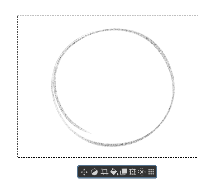
(Shown from left-to-right: Move handle for the Selection Mask, Invert Selection Mask, Crop to Selection, Fill Selection with Foreground Color, Copy (or Cut?) Selected Content to new Layer, Transform Selected Content, Deselect Selection, and a move handle for the bar itself.)

For reference, CSP refers to this as the selection launcher. More information can be found in CLIP STUDIO PAINT Instruction manual - Selection Launcher

1 Like

This is really helpful. In the actions add in edit selection too.

Once this paradigm gets in I think there should be one for transform tool too. Like flip, change mode etc.

We already do have a precedence of on canvas bar for assistants, may be we can re use part of that

8 Likes

It is also useful for Android users.

5 Likes

This would be very useful since there are so many actions related to selections. Currently I have pinned some of those to the toolbar, but they’re taking up a lot of space there.

Showing/hiding the selection bar could be (optionally) linked to show/hide selection imho.

Good idea!
Deleting the selection could ne added too. If it is configurable, then specific transform modes would be helpful as well (mirror, distort, etc).

I like this and feel this is very handy.
It frees up some operations from requiring a keyboard to just left-clicking/pen-clicking.

I think it needs a few more things though.

  1. remove the “move handle” icon.
    Currently you can drag the selection directly, you just need to move the cursor to the selection border (dashed line).

  2. Add a Clear Inside Selection icon and a Clear Outside Selection icon.
    This is sometimes much faster than using the eraser.

  3. Add the Convert to Vector Selection icon.
    In some cases it is necessary to convert to a vector selection, and converting to a vector selection removes the opacity information contained in the selection.
    This ensures that the fill does not contain the opacity of the previous selection.

  4. Add customisation.
    Allows the user to add or subtract relevant function icons.

  5. Provide an option to disable it in “Configure krita”.
    This allows users who do not like it to disable it.

Also, I think something similar is needed for some other tools such as the transform tool.

Imagine wanting to make changes to your selection but you can’t because there is a floating menu demanding attention and focus.

Maybe it should be made to display at 50% opacity?

That would avoid completely obscuring what’s underneath it.

As it is said by @OdinsGlassEye , the CSP floating bar is quite handy… but can interfere with your work on selection. Maybe a shortcut to call it ? Or a little icon to open it completely ?

3 Likes

Do you have any better ideas?

Just like the current assistant bar on canvas this can be moved asside by clicking and dragging the 6 dotted icons.

The current move operation by hovering over the border sometimes causes issues of accidental move. removing that and keeping this would be better. With this I will not move the selection unintentionally while making new selection outline from close to border.

5 Likes

I agree. When selection is very little, it’s hard not to move the selection instead of éditing it.

Donno what that is. Sounds more of an hasstle than anything.

Why not not just a context menu instead of a silly bar that manages to get always in the way and needs ways to place it out the way? Or even shortcut keys?

1 Like

It is already there in krita, it is not a new thing. it was implemented for the assistant tool on canvas bar. you can also see that in the mockup that @tom made

And the bar can be implemented without any hindrance to selection making too, this point need not be the sole reason not to implement this. We already have right click context menu for the selection. This one would be additional options which may help people without the pen buttons or people using tablets too.

5 Likes

The context menu requires more steps, shortcuts would not be a good idea either.

The idea of the floating bar is good, I who have used CSP can say that it helps a lot in the workflow, also someone suggested an option to activate or deactivate it, if you don’t like it, deactivate it and that’s it.

4 Likes

Oh that menu? Those handles are useless and always in the way I really dislike them like a lot. As I was imagining a issue to use. I already gave ideas to correct those menu bars that make no sense on another thread.

Assistant bars have some significant usability improvements in 5.2 that aren’t in 5.1, including precise hitboxes and their own move handles. I’d imagine it’d be even less of a problem for selections since you’d only have one visible at most.

2 Likes

You often make assumptions and mistakes about suggestions while simultaneously giving negative feedback and rejecting the suggestion, obligating other members to correct you. Guesses and whims are not valuable.

4 Likes

I think this is a good idea too, especially for transform operations.
In other programs when you work in fullscreen canvas mode having these helps tremendously, as well as on android tablets (all these are particularly true if you don’t use buttons/keyboard or have limited number of buttons available).

Especially on android devices the options docker for tools can be inconvinient because of real estate of the screen.

3 Likes

I also give positive reinforcement to good ideas with my “assumptions”. I guess no one notices those because it is just following the crowd at those times. But I don’t follow the crowd just because.

Still think a context menu to be better than something that blocks your canvas even if you can move it around. I am sorry if my opinion is not popular.