Alright, so we’re a few weeks further now, and I’ve been hard at work on get the properties docker from annoying (‘bugged’) to boring (‘just works’). But we’ve come to a little usability problem. To explain this problem, I first need to explain how the text properties docker works exactly.
So, when collecting the feedback on how the text tool should work, two major pieces of feedback were that…
- It should be possible to set text properties on multiple text objects at once. This is now possible, and also why the text properties are in a docker. You will be able to use the shape selection tool (the arrow) to select shapes, and any text shapes in that selection will have properties changes from the docker applied.
- There was some feedback that too many properties might be intimidating and generally bad for usability, and that kinda stuck with me, because I had been studying various text property widgets myself, and even I, who’d been a year neck deep in text layout was intimidated by many of them. Conversely, we do have a lot of properties, and many of them only make sense in particular contexts that might be confusing to newcomers (Like, what would you even use “word break” for?).
For the latter, I’ve decided to kind of lean into CSS’ ability to allow partial style definitions and inheritance. What that looks like is this:
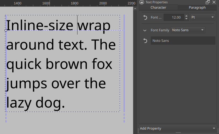
When nothing is selected, you are seeing the paragraph wide properties. On the left we only see the font size and family, as those are the only properties explicitly set.
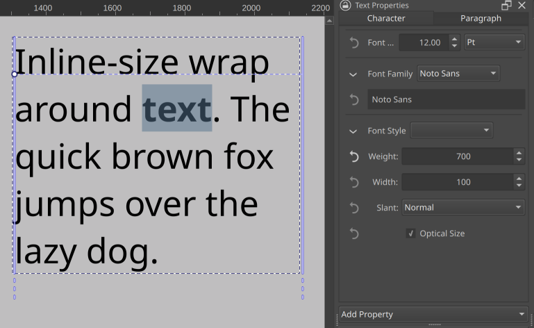
When we select a bit of text and set it bold, the text properties docker will show both the font style widget (the dropdown next to “font style” will eventually contain the subfamilies like ‘demi-bold’ and ‘extra-condensed oblique’, but that needs more work), as well as the font size and font family. These latter two are inherited from the paragraph properties, and can be overridden.
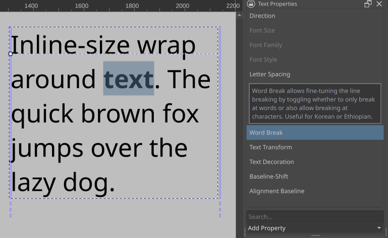
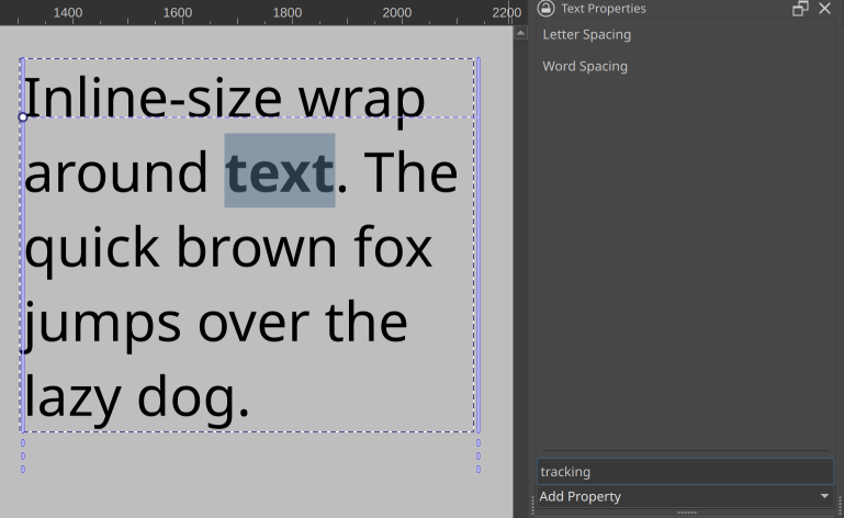
There’s an ‘add property’ dropdown at the bottom with properties you can browse through, with tool tips explaining what a given property does. There’s also a search that allows you to filter properties on both their title as well as given search terms. These latter often contain ‘terms of art’, that is, the technical term a property might be known under in some programs, like ‘tracking’ for letter spacing.
Then, you can also revert any properties you’ve set or overridden. This video kinda shows how that will look:
So in effect, this means that only properties that are currently relevant are visible at a time. The revert button should also make it easier for people to experiment with unknown properties, because they won’t have to remember what the default was, they can just press the button to make it go away.
I still want to implement the ability to configure to always show certain properties (this would be useful for font-size, family and style), as well as never show certain properties (the CSS white-space rule comes to mind). And of course, the ability to make presets so you can set a whole bunch of properties at once.
However, now comes our UX issue. What to show when there’s a selection of mixed properties? So, how to show there’s a range of text selected that is only partially bold, or multiple text shapes are selected with different font-sizes.
Initially, I just colored the revert button blue, which is a little too subtle.
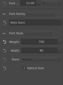
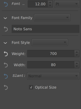
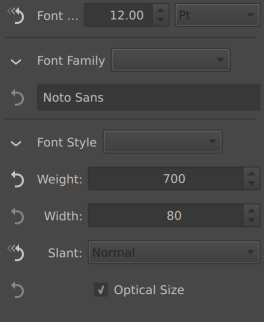
(In the above, font size and slant varies over the selection, but weight is set to 700, everything else is inherited or default)
One of the other options is to also set the relevant label italic:
Another option would be to straight up change the icon.
Finally, the one that would be most consistent Krita-wise is to disable the widget for properties like these and make them enable on click, as we do that with the layer properties window when there’s mixed properties:
Thing is, there’s no real standard way of doing this. Other software I’ve studied did a variety of things when there’s mixed markup, with some averaging, others showing nothing in the relevant widget, others showing the most common value, yet others showing the least common value. This variety might be an indicator we’re overthinking it a little, but we figured it wouldn’t hurt to just poll what would be clearest.
How to show that the property is has mixed value across the selection?
- Set Icon to Highlight Color
- Label set italic
- Different Icon
- Disable the input