Thank you so much for your hard work. I miss these typography functions while creating stile tyles or wireframes. It would help so much. 
Alright, so we’re a few weeks further now, and I’ve been hard at work on get the properties docker from annoying (‘bugged’) to boring (‘just works’). But we’ve come to a little usability problem. To explain this problem, I first need to explain how the text properties docker works exactly.
So, when collecting the feedback on how the text tool should work, two major pieces of feedback were that…
- It should be possible to set text properties on multiple text objects at once. This is now possible, and also why the text properties are in a docker. You will be able to use the shape selection tool (the arrow) to select shapes, and any text shapes in that selection will have properties changes from the docker applied.
- There was some feedback that too many properties might be intimidating and generally bad for usability, and that kinda stuck with me, because I had been studying various text property widgets myself, and even I, who’d been a year neck deep in text layout was intimidated by many of them. Conversely, we do have a lot of properties, and many of them only make sense in particular contexts that might be confusing to newcomers (Like, what would you even use “word break” for?).
For the latter, I’ve decided to kind of lean into CSS’ ability to allow partial style definitions and inheritance. What that looks like is this:
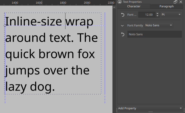
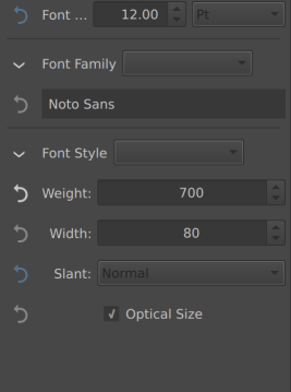
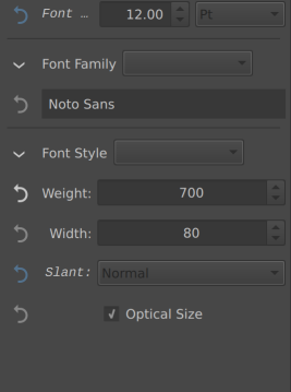
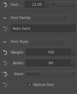
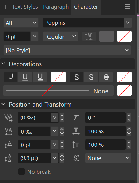
When nothing is selected, you are seeing the paragraph wide properties. On the left we only see the font size and family, as those are the only properties explicitly set.
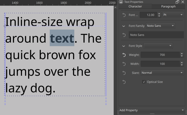
When we select a bit of text and set it bold, the text properties docker will show both the font style widget (the dropdown next to “font style” will eventually contain the subfamilies like ‘demi-bold’ and ‘extra-condensed oblique’, but that needs more work), as well as the font size and font family. These latter two are inherited from the paragraph properties, and can be overridden.
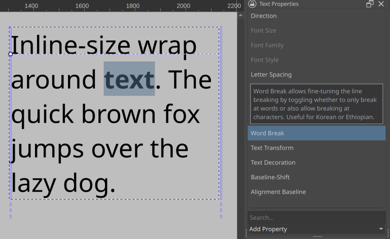
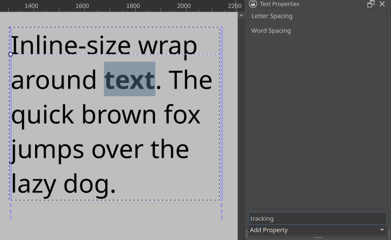
There’s an ‘add property’ dropdown at the bottom with properties you can browse through, with tool tips explaining what a given property does. There’s also a search that allows you to filter properties on both their title as well as given search terms. These latter often contain ‘terms of art’, that is, the technical term a property might be known under in some programs, like ‘tracking’ for letter spacing.
Then, you can also revert any properties you’ve set or overridden. This video kinda shows how that will look:
So in effect, this means that only properties that are currently relevant are visible at a time. The revert button should also make it easier for people to experiment with unknown properties, because they won’t have to remember what the default was, they can just press the button to make it go away.
I still want to implement the ability to configure to always show certain properties (this would be useful for font-size, family and style), as well as never show certain properties (the CSS white-space rule comes to mind). And of course, the ability to make presets so you can set a whole bunch of properties at once.
However, now comes our UX issue. What to show when there’s a selection of mixed properties? So, how to show there’s a range of text selected that is only partially bold, or multiple text shapes are selected with different font-sizes.
Initially, I just colored the revert button blue, which is a little too subtle.
(In the above, font size and slant varies over the selection, but weight is set to 700, everything else is inherited or default)
One of the other options is to also set the relevant label italic:
Another option would be to straight up change the icon.
Finally, the one that would be most consistent Krita-wise is to disable the widget for properties like these and make them enable on click, as we do that with the layer properties window when there’s mixed properties:
Thing is, there’s no real standard way of doing this. Other software I’ve studied did a variety of things when there’s mixed markup, with some averaging, others showing nothing in the relevant widget, others showing the most common value, yet others showing the least common value. This variety might be an indicator we’re overthinking it a little, but we figured it wouldn’t hurt to just poll what would be clearest.
How to show that the property is has mixed value across the selection?
- Set Icon to Highlight Color
- Label set italic
- Different Icon
- Disable the input
0
voters
Thank you for all this work @wolthera and your explanations 
I think the first item of the poll should be its title?
… And you corrected that very quickly 
I voted different icon and set label to italic, this is what I’m used to from Visual Studio and other IDEs for similar things like the property inspector. Blender does something similar too, if I remember correctly. However I would propose another (or an additional) solution and that is putting these things in their own groups.
The thing with just formatting the label or changing the icon is that you have no idea what that is supposed to mean if you just see it for the first time and nobody told you. At worst it’s not only italic (for inconsistent values), its also bold (When not every object has this value) or underlined (actually I forgot what that meant, I think that it overwrites child or something).
So I can’t remember where I have seen this before but I really liked the thing when it was grouped. This was weird at first glance because properties seemed doubled but from the group labels I could easily see, oh, this affects all selected items, changing this will only change the ones that are currently not set (or formatted in the context of a text tool) and properties that were not shared by all selected objects were in a collapsed group by default, same as inherited properties. I can make a mockup later when I’m back from work, if my description was too confusing.
I think I understand what you mean (you seem to want a sort of sorting?) The thing that has made me want to avoid sorting is that if someone overrides a property it’ll pop away from under the cursor to the appropriate sorted section, and I thought that might be very unpleasant…
If I only could remember the software where I have seen this before I could just make some screenshots (maybe it was Godot, idk). But basically not sorting but Grouping. But you’re right the groups and their items vanishing or popping up, that did happen there as well but I still fund it to be more understandable than just making labels formatted differently. But it would also allow to select a bunch of text and then only change the bold to italic without the rest of the text that is normal formatted being affected.
I saw the grouped property editor in some coding context, not sure how good it would be for just text editing, honestly.
If I understood this right, the reset button will be used for resetting the individual changes done in text back to the global setting. In my opinion, it feels unnecessary and un-Krita like. I think no other properties in Krita uses a reset button. Except for the reset brush preset button. The UI would feel cluttered I think.
Blender uses backspace key to reset most input fields. Some applications use double click on label to reset. Adding a button on each property feels too much in my opinion. Maybe just a single all property reset button would be fine. Also I think it may be confusing when more than one word is selected, each with different font styles. Or if the overridden property is applied to most of the text in a paragraph.
It may prove to be useful, I am not sure. I feel like clicking a reset button and just changing the property would be about same effort. Though I do feel a global reset button would be useful.
I don’t know, the transform tool also has a Reset button, it’s not a foreign concept for Krita and without a way to reset individual changes there would not be a way to undo single text editing steps, you could only undo the whole text changes or none. That would be terrible.
I feel like clicking a reset button and just changing the property would be about same effort.
Maybe true for simple properties like font weight but selecting the base font family back from a list of hundred entries is definitely more cumbersome than just clicking a reset button.
I like a different icon and also the italic text. But I am okay with different icon only. Along with different icon we can have a tool tip saying “multiple properties in selection” or something like that.
This is really well thought out I really like the idea of keeping only the properties which are enabled. I would suggest showing the most common ones bye default so that it is just easily accessible for light editing. Like bold italic font size etc.
I also like the reset button really nice idea.
Additional request - Ability to save presets of font styles and properties and also set the default. So user can set the default and also have various presets ready for applying.
I’ve chose “Different icon” but I’m more used to Scribus UI.
Note: I’m aware Scribus UI can be complex and too complicated for a lot of users, but when you take 10min to try understand how it works, it’s not complicated; also Scribus have one of the most complete text properties UI settings I ever saw
In synthesis, in Scribus:
-
All properties are immediately available through collapsible sections
– on my side I like to be able to find properties from first look, without having to click everywhere
– something hidden behind a button will probably never be used -
when multiple format are available in selected text, the format under the cursor is available in UI
– Then UI never change
Now my point of view:
-
Having to add property with a dynamic UI
- UI looks clean if there’s just one bold property yes, but a lot of users will probably ask help to get an explanation about how to click to get a bold or italic…

- A dynamic UI updated according to selection may be disturbing, potentially it will always change
- Helping people here will suffer to help users because it might require 10 posts to get a correct screenshot of UI

For me:
-
Have a simple mode UI for 95% of users needs:
– font familly
– font size
– italic, bold, underline
– color -
Then also have an advanced mode UI:
– all properties always visible, like in Scribus
- UI looks clean if there’s just one bold property yes, but a lot of users will probably ask help to get an explanation about how to click to get a bold or italic…
-
The reset button, I like the idea, but:
– Having it to right side rather than left side, looks more natural to me (but it’s me)
– Maybe use the same ‘reset’ icon than one used in QLineEdit components “⌫” (current icon is the “undo” icon but the action is not to “undo” the last modification but to “reset” if I understand) -
The selection with multiple text format
– My point of view is to do like Scribus: simple, efficient, probably easier and simpler to implement, less open to bugs as it’s always the same rule: provides information from text under the cursor
After whatever you’ll do, it’ll be Ok as long as you’re satisfied by your solution and all the properties you’ve take time to implement in text engine are available in UI 
For sure, there’ll be people happy, and some not: too much, not enough, should be like this, should not be like this, …
Grum999
Because this is coming up multiple times now:
This is planned…
I’ll make sure that in the eventual config widget going between ‘dynamically visible’ to ‘everything visible’ is practically one click. I just kinda have a lot to do still…
While tool tips are always good they get often overlooked and they also don’t work on mobile devices like an android tablets because you can’t hover a courser over them.
I agree with adding a global reset button.
But a separate reset buttons would take up too much space in the UI.
And,If possible, it might be a good idea to display an icon in the value column.
Also,In addition to Advanced, it could be switch nice to have a Compact UI mode too
(Some commonly used properties consist of an icon and a value field.).
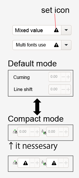
(It created a mockup using Inkscape as a reference.)
This is a good point. I think really about time we also consider design that can also work for android [tablet mode]
I also like this suggestion.
Im glad something like what @Grum999 suggested is being consider.
Very happy that we are at the point we are now discussion UI/UX of the text tool ^-^.
I also pick “Different Icon”
Under properly group settings.
You could fill the input box for those properties with a text like: “varies” or “multiple”. This indicates that if you change the value in the input box, you’ll overwrite all properties to be a singular value again. That’s how I see other software solve such things.
I feel like the revert buttons take away the clarity of the docker, because the arrows are actually larger than the v arrows that you use to open and close a certain section (Font Family/ Font Style). A right click to reset would save you a lot of space in the interface.
Also do the inputs need to be this wide or could there be a second column as well? Indesign and Affinity use icons to indicate text properties:
This works quite well, I’d rather see a simple and advanced editor, than having to add properties to the text itself. One of the concerns I have is that the order of the properties may change depending on when it was added. So the properties could end up in different places across text and across documents.
Why not use Ctrl+Z?
This is a very good point indeed. Manually adding properties would make the UI different for different documents and users, which would be more clunky I feel. Maybe a collapsible section can work? I have not seen a collapsible section in dockers UI, only in configure menus.
Sections like this could be used for grouping the different common to advanced text properties. The most common ones should be visible by default.
No ctrl z on tablet and limited to the previous action. An honestly I wouldn’t want every text change to polute the undo history. How is undo actually managed with the new text tool?
- The reason I avoided icons is because icons cannot be searched for on the internet, property names can. Similarly, in the case of mobile we cannot rely on tool tips to do all the work here. Similarly, right click to reset may not be available.
- The reason the inputs are primarily single column (not all of them are) is because many of the input boxes are later going to be replaced with sliders, as these are easier to manipulate with a stylus. Single columns are also easier to resize in width.
- The reason I’m avoiding collapsible boxes unless really necessary is because this makes it easy to hide properties that are actually set, as well, it makes it hard to find properties.
- The reason I’d like to avoid ‘advanced’ and ‘simple’ UIs or an alternate ‘compact’ UI is that this gives maintenance burden. That is, one or the other of the UIs is going to be more likely to have bugs.
- Another wrinkle with ‘compact UI’ is that there’s probably far more toggles than you expect (this is because different text layouts just plain work different, so a CSS based one has different properties than Adobe’s text engine, meaning there’s extra toggles in some places and less toggles in others).
- BTW, undo in Krita merges similar undo states. So multiple text property changes on the same range get merged into a single undo command.
- The properties list is not dynamically sorted in any way, but rather follows a hard coded list based on the feedback given about which properties were most important.
- I wanted to avoid warnings for regular usage, as I’d like to reserve them for explaining why a certain property may not work, for example, to explain the current font has no ligatures when I’ll get to the ligature property.
Right now, this mixed-markup problem is the main thing blocking this merge request. I’ll let the poll go for a bit. After that I need to go over each property and polish it. This ranges from making the font chooser actually work to fixing bugs. What I’ll do is that I’ll write a little introduction post of each single property and what it does, so you’ll have a better idea of how many toggles it needs.
After the technical bits are in place we’ll evaluate where to go next with this. It might be that someone else just takes over the whole docker, because the code is pretty isolated from the text tool itself and the hard bits will be done by then, and I’ll be able to focus on bugs and stuff like text-on-path instead.