Text Tool Thread

So a ctrl z would basically reset the entire text object to it’s initial state instead of the single changes being reverted. This calls for the reset button again.

In the current text tool an undo however still undoes changes in sequence, at least as long a the editor is open and wasn’t closed in between edits. Will this still work with the new tool?

same range is the key here. So if you select a word, change width, size, then type something, that becomes 2 separate undo states: changing text properties (on that first range) and adding text.

(Adding/Removing text works similarly, it gets merged with the last text add and remove command)

EDIT: You can test this already in latest master by doing in sequence, bold, italic, and changing the color a whole bunch.

3 Likes

I could not agree with this statement more. :+1:

1 Like

If you hover over the icon, you could show a tooltip, which is searchable again. Having a lot of text in the docker makes it very tiring to work with, because you need to read the text to know what you want to do, as opposed to glance over icons. With text, you cannot perform pattern recognition, where you just pick out something that looks like what you need from first glance. Over a long working day, this really has an impact, I can tell from experience.

You could make it so that click dragging on the icon works as sliding, granted it is less discoverable but it fills both needs. In Photoshop and Affinity this works rather well — even if there is already a slider you can use. In those cases, you don’t have to pick the dropdown first (e.g. with opacity).

Wouldn’t it be possible to use the properties with templates, so you can use the underlying logic of what you have now and add properties that you deem basic or advanced with a switch between the two? — Just trying to think out loud here.

For brush strokes, the undo grouping that was recently implemented is actually a good thing, but for text, what’s the advantage? And shouldn’t it be changed?

3 Likes

I second this.

I feel that text editing icons recognizable enough to alot of people and less exhausting to read than a text. Many of us have use a text editor/ document suit that some icon looks are already familiar.

Also terms like kerning and leading are probably not familiar to a number of user [like those who don’t deal with font / graphics / text stuff] and might not know what those are.
Usually kerning and leading icons show what they are for even if one don’t know what they are called. There are things i dont know what are called for in text stuff and rely alot on the icons to know what they do.

1 Like

How to do this on an android tablet?

1 Like

Since most likely it will be used with a stylus, the hover should work on android too right? Or if that does not work, a long press is used in some android apps to show tooltip text.

1 Like

Well, I guess you’re right. I honestly have trouble getting tool tips to show even on my desktop with a stylus because my hand never seems to be still enough. You have to take the pen completely away from the tablet for it to work which always makes me feel dumb because I forgot about. But perhaps that’s just me, so. Yeah. There are a few users painting with their fingers though which in the past showed other issues since Krita isn’t really made for it.

1 Like

Does the desktop experience have to be worsened to accommodate for android is the second question, which I answer with a “no”. Of course there are other considerations though.

3 Likes

Ok, so short update:

The text settings docker is still not merged because all manpower went into the 5.2.3 release, and the person who’d review my patch went on holiday. That said, I did manage to discuss fonts with him, and I’ll be working in the meantime on the font picker as well as improving the underlying font selection mechanism.

So hopefully in a week or two I’ll be able to show the font picker and explain the different font selection features, as well as a supplementary technical deep dive blog post rambling about the 5-10 ways a font file can describe its relationship to the other fonts in the same family.

I hope to do this with other properties as well as I polish them, and then hopefully you guys will have a better idea of what the text layout is exactly capable of.

16 Likes

Looking forward to this new feature :star_struck:

Ok, so, it’s been a month.

The text properties docker branch got merged. However…

  • it is still very buggy, with all sorts of UI paper cuts all over the place. As said before, I need to polish everything now.
  • If you are going to test it, note that right now, in the text tool, if you have no selection you are editing paragraph wide properties, and if you have a selection you’re editing properties in that range.

We’re not particularly happy with this interaction mechanism just yet, and my hope is that after I have fixed all the main bugs and papercuts, we have a testing round again. And in that testing round we’ll decide together on what would be better. Before that however, together with the bugfixes I’ll be doing my promised feature introductions, because otherwise the different issues I’m bumping into may seem too abstract.

Which brings us to the first introduction:

Font Selection Properties.

This covers the main font family selection and the sub styles. To get this to work properly, I needed to do a ton of background work, as there’s like, 5 different ways fonts describe their relationship to one another. I’ve written a blogpost discussing all those technical bits.

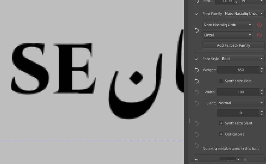
There’s two main widgets associated with font selection. The font family group, and the font style group, both groups are collapsible, with a main widget “above the fold”, so to speak, controlling the main feature, and advanced options underneath the fold.

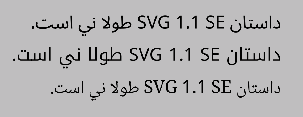
For font family, the main feature controls the first font family in the font family list. CSS requires that if a font is missing a glyph, it tries to select a different font. The font family list gives control over which font families it tries to fallback to.

This is mostly useful for mixed script situations, where selecting a fallback font can allow you to select a font that more closely matches the tradition of the main font.

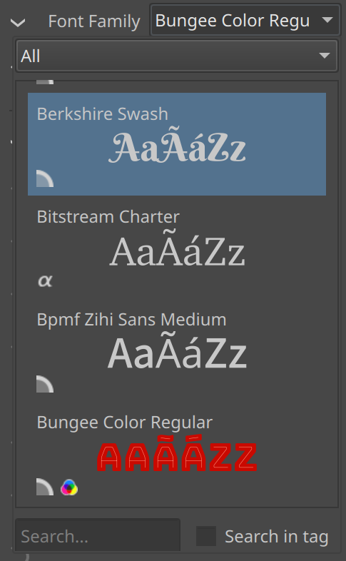
The font families themselves have been made into resources. This means that they can be tagged and searched the same way as other resources. There’s a nice big preview available, and if the font has names for the locale you’re using Krita in, it will display those too.

As you can see, there’s a number of icons at the bottom. These are to indicate what kind of font we’re dealing with, like PostScript or OpenType or variable or color. It currently has some placeholder icons in place.

Question: Do you guys want to help me with better icons here? Should I make a new thread for that?

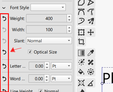
Then, for the font style. The main widget is a dropdown with style values as you may know them from other programs. These are either sub family fonts, or variable font instances. Selecting one of these sets up the appropriate CSS font property values in the advanced settings.

There’s 4 major font properties:


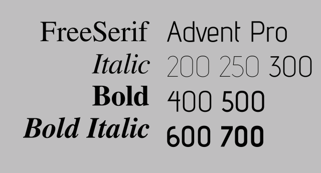
Weight controls how “heavy” the font looks. It goes from 0 to 1000, with 400 being regular and 700 being bold. This one can be synthesized, and I’ve added a button to turn off synthesis.

Width controls whether an expanded or condensed version of the font is selected. I’m not allowed to synthesize this. This was also the troublesome feature when using Qt’s font stuff, as that didn’t report the width of a selected font correctly, leading to things like Futura Condensed or Bahnschrift Condensed not being selectable. That’s fixed now.

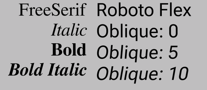
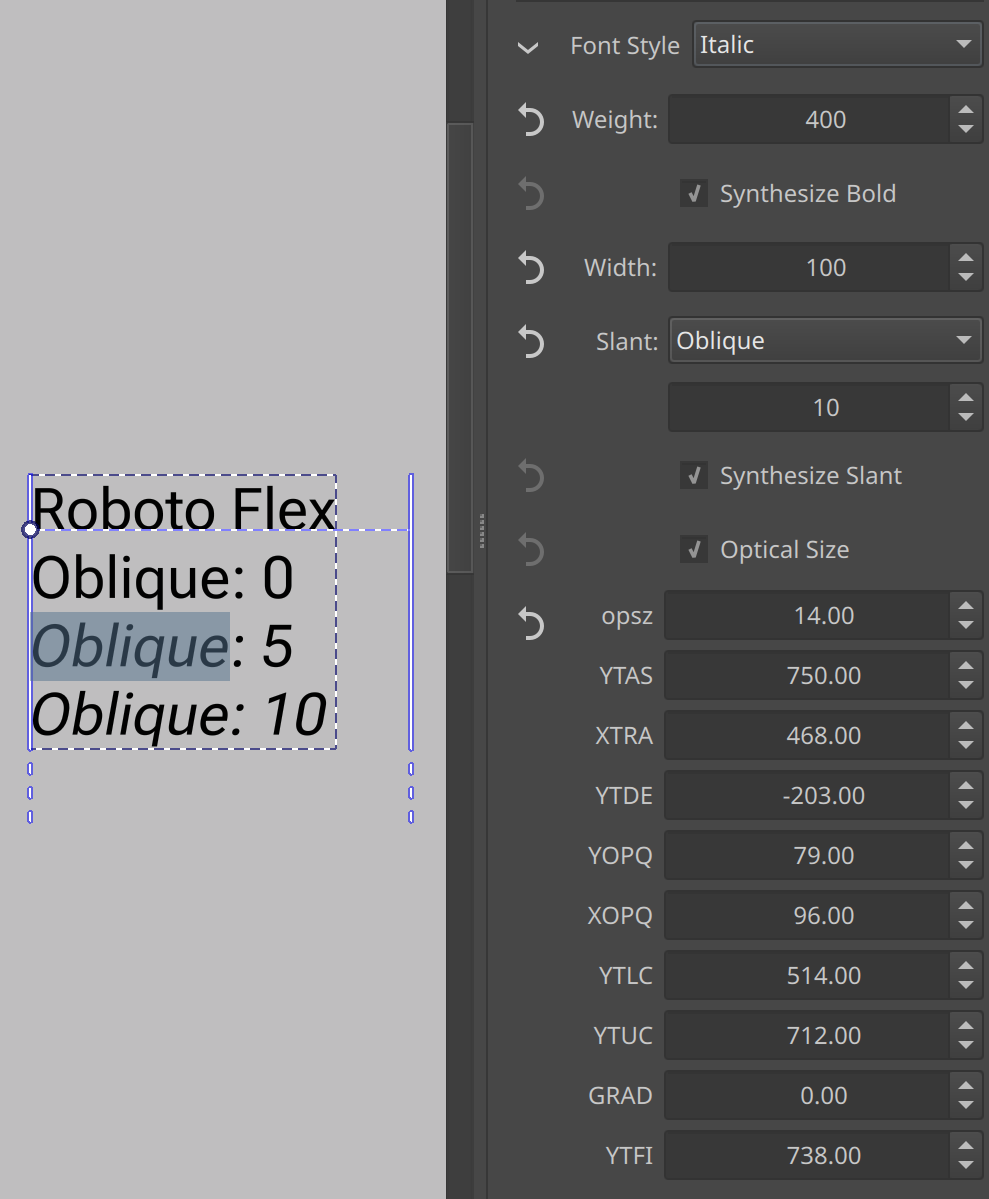
Slant controls whether we’re using the upright, italic or the oblique version of a font, and in the case of oblique, how strong the angle is. The latter is only used by variable fonts like Roboto Flex. Here too is an extra toggle to turn off font-synthesis (which just applies a slanting transform to the glyphs).

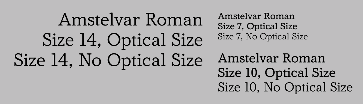
Then there’s the Optical Size toggle. Some variable fonts have different glyphs for different sizes. The smaller size glyphs tend to be less delicate and easier to read, while bigger size glyphs are more detailed. This toggle controls whether to automatically scale this with the current font size.

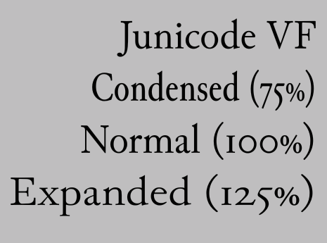
Finally, there’s the extra axes list. This too is for variable fonts. In this example Junicode VF has an extra Enlarge axis, that changes how big the x-height is. Optical size, if available is also in this list.

These are always decided upon by the font creator, as is the label for it (these too, are localized, as are the style names), which means that for a font like Roboto Flex, which has quite a few of these extra axes, the font designer apparantly couldn’t be bothered to name them nicely:

So, this one is gonna take a while to merge, because there’s all sorts of weird edge cases I am bumping into. The next property I want to tackle after this (and then introduce) are font-size and line-height, which still have some unit problems.

13 Likes

Is it finished getting merged into krita next build on krita.org or do I have to wait for a bit?

You may have to wait a bit, I literally wrote this post as I got the text properties docker merged (and then, the fonts stuff is in a different branch still), so its not done baking yet :slight_smile:

3 Likes

I’m testing with the archive build from invent.
Here’s my 2 cents from the first impresssion, feel free to consider or ignore it:

1
It looks like it’s going to be a completely seperated docker, but maybe it’s good to have it merged into the tool option- so that the text editing won’t have duplicate control panels and take extra space all the time when the user is not editing text.

2
This parade of Revert Property buttons are uglier than I thought;
krita_uFWo6LlFPr
I feel that it’d be not really a problem if it’s just entirely managed in Add Property section, with checkboxes of something. To show/hide evey single individual property in the panel is not really necessary or critical when editing text in the first place.

Other than that, it seems working with no bug so far. Cheerio.

1 Like

You can use it in combination with the shape select tool as well, so it needs to be a docker.

The revert buttons have a bit more purpose than show/hide or even just revert. They’re related to CSS inheritance, and one of my communication mistakes is that I assumed that there was more familiarity with that. When we’re getting to font-size/line-height and units, I can explain CSS inheritance in depth, as then there’s some actual examples I can give what its purpose is, and how it affects the widgets.

Cool. I just think it’s a bit ugly(sorry :melting_face:) to have it in the UI, and to me it’s only there to make me unnecessarily and accidently click it sometimes. But it’s not really a big deal… I’ll wait for the follow up.

Thanks and keep up the good work.

Yeah, sorry, I wish I could program harder to get everything in place as I think it should be, but there’s a limitation to how fast I can go :upside_down_face:

7 Likes

No pressure.

1 Like

Could the font selector be a type-in dropdown (e.g. like MS Word) so you can also type the font name rather than scroll the entire list?