I’m sure someone has mentioned it already, but here is my 2 cents.
The good: on screen text editing: this is great and very appreciated!
The bad: the rest of the GUI.
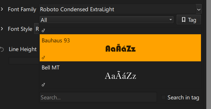
The text tool options in the tool options docker is a HUGE list. It almost doesn’t fit the height of my screen.
On top of that, you have a separate text options docker, which is also RIDICULOUSLY huge. There are SEVERAL lines of options when all is expanded, so it uses too much vertical space. And there is simply too much margin. I mean, I get that people use Krita with tablets, but they use it with a stylus, right? Nobody is using Krita with their thumbs? Why is there so much space.
I also noticed that there is no tooltip for buttons like the justify button on the top-right corner. It looks just like a hamburger menu.
It’s only open source software that have this sort of extra-large UI. If you use something else like Affinity, Photopea, DaVinci, etc., the GUI is always compact. I don’t understand why this keeps happening.
As an aside, I noticed that resizing an undocked text options docker in Krita 5.3.0 seem to lag a lot even in a blank document. I needed to undock and resize the text options docker to try to find where to change the color of the text and then I immediately noticed this.
I agree with others that a floating toolbar for basic things like font, font size, italic, bold, and color would be great. GIMP has this, for example. CSP has one even for the transform tool.
As for the color picker missing… Krita is in a dire need to having a single consistent color picker for the entire application instead of each different dialog having a different way to pick the color. I’ve heard the argument that some people like the native picker, but Krita could just have a button in its custom color picker to display the native color picker. I think I have seen 3 different color pickers in Krita already, and there are also at least 2 different ways to select gradients.
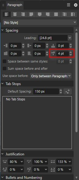
For comparison this Affinity’s
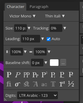
And this is Photopea
Observe that they use a GUI layout with multiple settings in a single line instead of just one setting per line. Does “Font Size” for example needs to be a full-width widget?
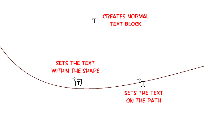


 Icon there. And add a message, when editing the shape or text
 (if I didn’t see that either I’m sorry) or you could change the icon every time you toggle that button. Only changing the state does not tell me its function.