My request is to add an option to make groups more visually distinct from layers by turning them into folders which will be shorter in height than layers.
Currently Krita has 2 ways to visually distinguish a group from a layer.
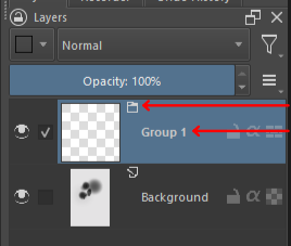
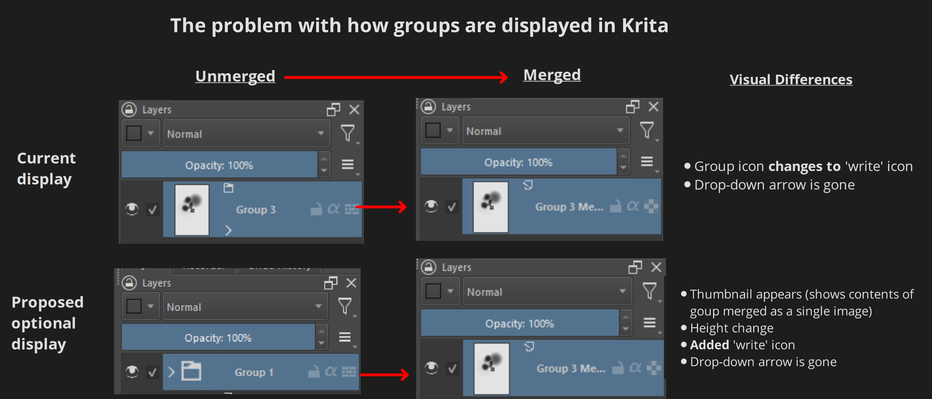
Why didn’t I mention the group’s thumbnail icon? Because it doesn’t always distinguish it from a layer. A layer itself contains actual imagery but a group does not because it’s main function is to contain layers. Visually distinguishing a group from a layer not only makes it easier to spot a group but makes it very obvious when you merge a group like so:
If you think in terms of art related concepts, implementing this feature creates a contrast between a constantly changing entities (layer thumbnails) and a visually unchanging entity (group folder icons), that contrast makes it easier for a viewer to distinguish the two. I am biased in my reasonings since I switch between painting softwares often but I hope you can see some validity to my claims of this method of displaying groups as more intuitive for the average user.
I think this could make organizing groups and layers easier for existing and new users of Krita. If you agree, feel free to vote this feature request.
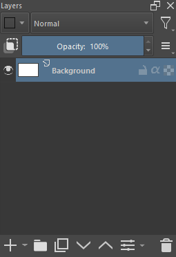
If this feature were to be implemented, it could be added to the Layer docker’s menu like in this mock up:
Note: I’m aware this has been mentioned in a previous request, but it’s ability to make Krita’s UI more readable has not been explained to this degree. I think this feature in conjunction with tree indentation can make identifying groups even easier for the average user. I also thought responding to the request wouldn’t create as much traction as a new topic. Feel free to merge or take this down if needed
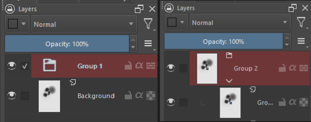
Groups are much more closer related to layers than to anything that is a folder. For example: Groups can have filters, masks and blending modes, they have pretty much all the properties of a paint layer except that you can not paint on it directly (and they can’t have FX I think). Personally I rely a lot on groups having thumbnails because that makes it easy to see what the composed image of its content is when the group is collapsed, therefore making it easier to see what its for even when it is not named correctly or at a different position in the stack.
I support making them more visible distinct somehow or having your proposal as an additional option but treating them like folders is functionally and semantically wrong.
Groups are much more closer related to layers than to anything that is a folder.
That was my assumption when I saw that groups are actually called “Group Layers”, but I was unaware of groups having filters, mask, and blending modes applied onto them like layers which is insightful.
The aim of my proposal is to have this feature as a togglable option so we’re both in agreement.
It’s an optional tradeoff: A user won’t be able to see the contents when the group is collapsed, which makes them rely more on its name (and color if the user applied it). But it will save vertical UI space for more layers to visually fit in the Layers docker, make groups styled distinctly, and make the Layers docker more intuitive for those already used to relying on names rather than group content thumbnails (those being usually Clip Studio Paint, Photoshop, Rebelle, and SAI users).
Tl:dr
Some users prefer reading names than thumbnails, this feature would make Krita’s layer management inclusive to both.
Groups are composited separately unless they have passthrough mode active so we need to take that aspect into account. I also agree that group needs to be a bit more highlighted.
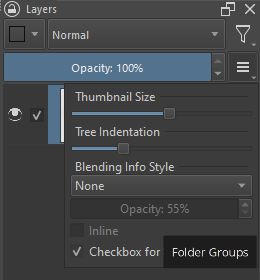
I agree with takiro on this one. Groups layer themselves and should have the same display as layers. It is just how krita works. You coyld argue bigger icons but not erasing thumbnails from them. You already have option to block thumbnails i use it. But it is the composition of the layers inside and it is already optional. Making a random change to groups in the layer stack is just super weird this is not PS groups. Not to mention make the code with even more exceptions.
It would make sense to remove the preview for pass-through groups only, because those are just organizational “folders” and don’t have useful content of their own. As far as I can tell, they currently just give you a totally blank preview, which is pretty useless and could be replaced with an icon without losing any information.
That would be great if it only applied to pass-through groups, since it would align with their function and not disturb those who use the features of Krita’s group layers. then maybe a plugin could be made or an option that toggles group layer creation to automatically be pass-through groups.
A plugin should be possible, as would be a separate action that you can shortcut to. A setting is a bad idea due to how rarely a pass-through group is useful, it’d serve mostly as a footgun for users that don’t have a firm grasp on how image compositing works. In particular, unlike in Photoshop, clipping groups in Krita involve explicit groups, so you’d probably just be turning the pass-through back off more times than not.
I found a simpler workaround to this which is a plugin that automatically labels groups a different color than layers so there’s no need to hide any thumbnails. It highlights newly created groups and existing groups. This is good enough for me so I will mark it as solved