Great thread fullerhill_art!! Glad to see more people discussing Krita’s UI! 
I have been busy with school so I have had an unfinished Krita UI mockup lying around some time with changes I would love to see. But now that I have more time and with this fantastic thread, I feel it is the perfect opportunity to finish it up and share it!
The ideas I propose is not a total redesign or a large change in how Krita functions, but how I think some small visual tweaks can greatly improve and modernize the look of Krita, while making the program clearer.
(They are aimed at the current interface, not the beautiful mockups people have shared!)
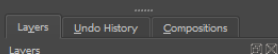
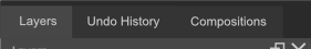
- Visually separate the dockers
Sometimes the dockers blend into each other. It seems like a long list of options instead of different customizable “windows” for different uses. Even though I have good control over my dockers, and they work fantastically, in my head they look a bit overwhelming.
I suggest separating them. This makes it easier to understand at a glance, and keeps things sorted!
Before:
After:
- Make the tabs slimmer
Me, and a lot of other people seem to change to “Subwindows” just to avoid having those large tabs. They take up so much space, especially on small screens. In my opinion they should be slim by default, and there should be a setting to make them “Touch Friendly”
I wrote more about it here: Option for thinner document tabs
It is also hard to see what document you have active, as they are too similar in colour. I suggest having the inactive document displayed in a darker colour.
Before:
After:
- Remove that dang line
It is a very tiny thing, literally the width of 1 pixel, but I cannot seem to ignore it. It is super sharp, and eye catching and messes the header look noisy and messy. It is so light compared to the (often) dark UI, and creates unnecessary contrast.
From the very first time I opened the program (and I genuinely love Krita insane amounts) I have always looked at it and had a strong dislike for the line. I want it gone. If an update came to Krita with the only new feature being the removal of that line, I would be extremely happy and consider it a fantastic update.
Before:
After:
Thanks to wojtryb for bumping it earlier in this thread! I am deeply passionate about that dang line! 
- Modernizing the look of the tabs, while making them clearer
This is mostly personal preference, but I think the current tabs looks dated. I would like to see them updated! Also it is a bit hard to distinguish what tab is active, since they are so similar in colour. I suggest making them simpler, and make it so the active one stands out from the others. If there are a lot of tabs and the names gets cut off, I think it should be swapped with icons, like on fullerhill’s mockup!
Before:
After:
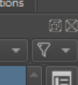
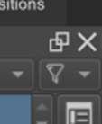
- Update the icons
This is mostly aimed at the docker buttons for closing and undocking. They look samey, and the icons inside the “squircle” are so small they just look a bit like noise. I suggest removing the squirlces and keeping it simple, whit an X and a “window” button. In my opinion, it looks nicer, it is more readable, easier to click, and people are accustomed to what the X and Two squares mean.
I have seen Linux builds of Krita having some great looking icons on the docker! I am very jealous! I want the program to look as beautiful on my devices as they do on Linux!
There are also some other icons like these I feel need to be changed at some point: Replacing the zoom and rotate cursor with new icons
Before:
After:
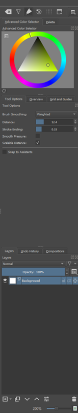
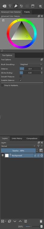
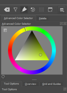
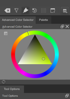
- Add some space around the Advanced Color Selector
Tangents in design are very eye catching, and an interface in a drawing program should be as pleasing and calm to the eyes as possible, since you do not want your gaze to travel away from what you are drawing. The docker looks a bit claustrophobic in my opinion, because of the tangents, and I think a little space does wonders! It does not need to be much, just a little bit!
Before:
After:
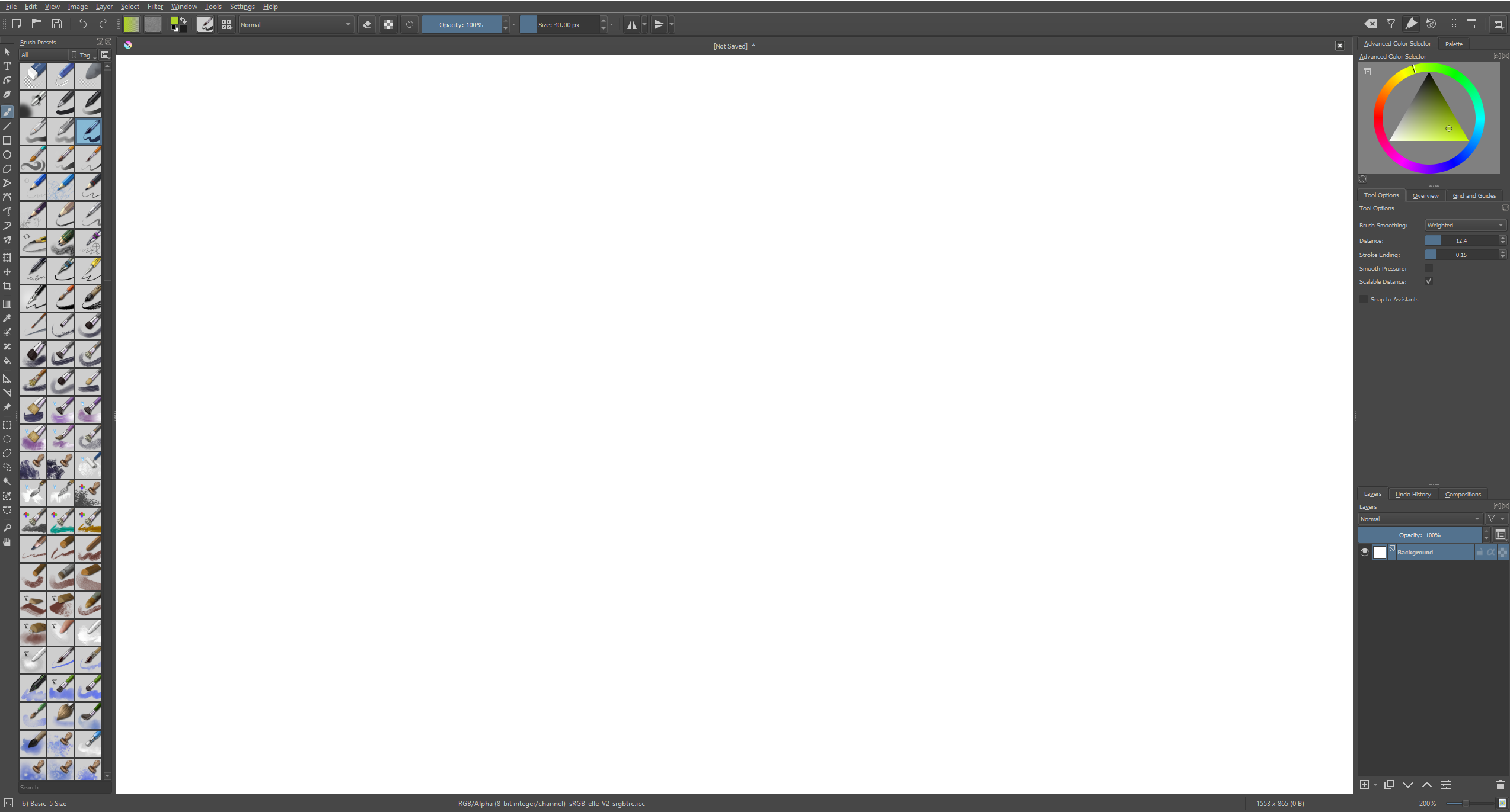
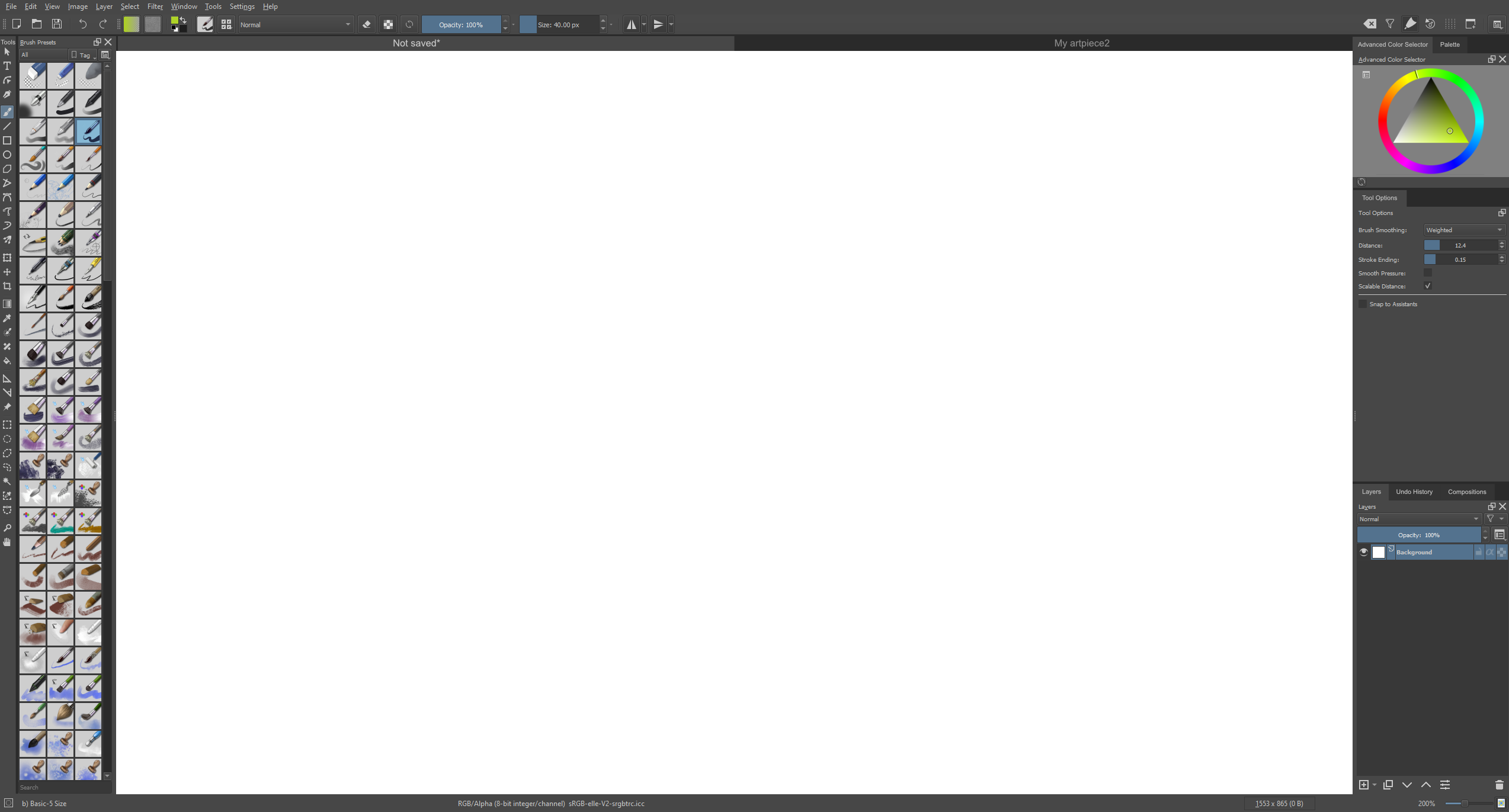
Here is the final Before/After, with all of the changes combined
Before:
After:
If all of Krita gets small treatments like this, I think it will turn out absolutely fantastic! Thank you for reading!
@fullerhill_art On your mockup you have already solved a lot of the things that I have touched upon! And a lot of your suggestions like workspaces as tabs are wonderful! I have enjoyed seeing your designs! Keep up the great work man!
Edit: tapatilorenzo pointed out to me that the underlined characters on the tab names were missing, I totally forgot to add them back in the mockup! I would like them to stay, even though they are missing in the mockup. Thanks for pointing it out!