I first got the idea through this post about plugins. But I think it integrates better with krita’s own components.
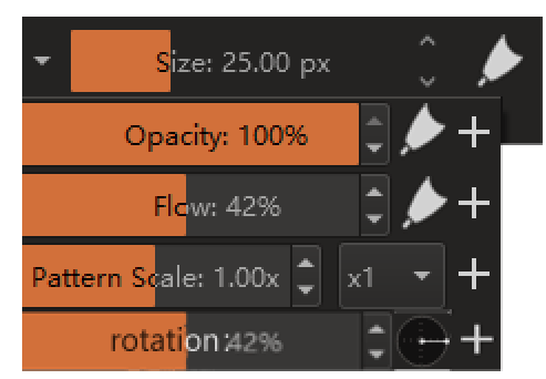
The picture below is my design. The pressure sensitivity of the “direction” is not important, so I replaced it with an angle icon. This is also discussed before. In addition, “spacing” and “fade” may also be useful, but not too much. This requires some discussion.
6 Likes
These are nice.
And yep brush rotation will be useful [ though i dont use it] i read some who are looking for a quick access to it.
Fade - is more for softness/hardness control for certain brushes that has it [atleast how i use it] / i personally use it as my main brush is use with sliding that up and down. 
i think generally some just one a compact / basic brush editor. The main editor is good if you really are to create different brushes. Its very powerful. while painting the ability to get to some of the property is something i want. [though those properties probably varies person to person, like i don’t look for rotation on the go - but love modifying fade on the fly]
1 Like
The key problem is that it is useless for “soft” type brushes…
Perhaps CSP is doing better in this regard: their pen settings can display the required parameters in docker to facilitate modification.
However, the interaction design is different from krita, and their pressure-sensitive page needs to be opened by a button. It is not intuitive or convenient in the brush interface, but it has certain advantages externally
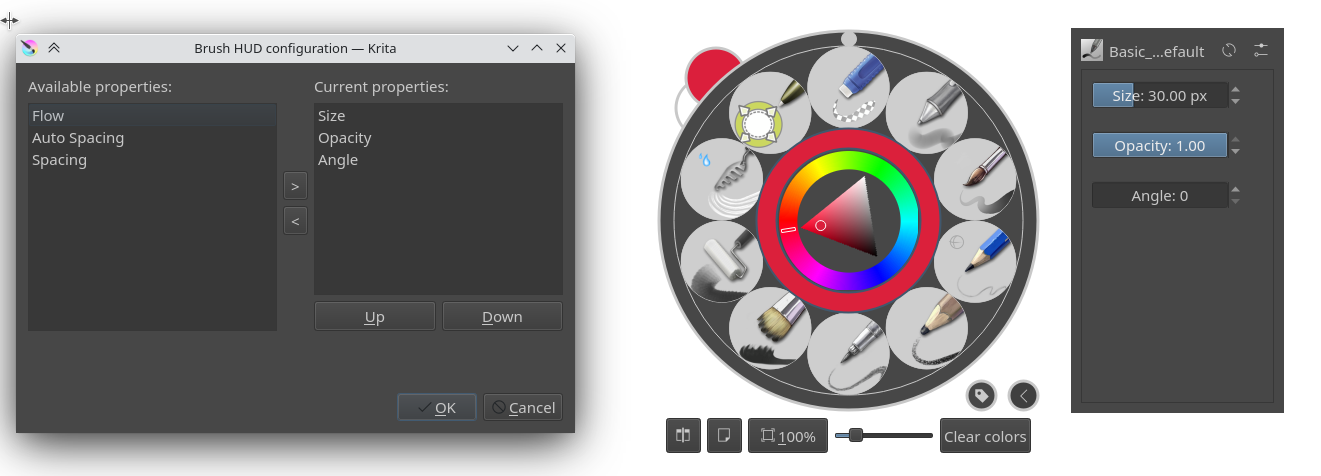
Can this be in the tool options docker? In essence it is options for the brush tool right. There you can have a section called “common settings” and list these sliders.
Also note these are available from the right click popup palette too but that requires similar number of clicks in comparison to accessing these from the brush editor I think
5 Likes
The brush editor feels much more cumbersome to me to use that the pop up palette. It’s pretty quick to right-click, adjust settings, keep painting. I’d definitely like to see these options there above all!
2 Likes
I agree. the brush editor looks busy and overwhelming. Most of these are already there in the right click popup palette.
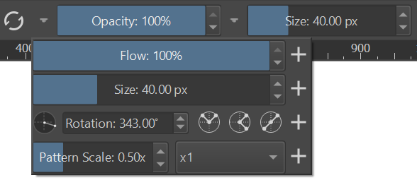
This is a screenshot of 4.4.8
I think having them in tool options docker will also give more quick access.
I would be glad if there are switch-checkbox between “Drawing angle” / “Tilt direction” / “none” allowing only one option be active at time.
Related topic: Fast switch between "Drawing angle" and "Tilt Direction"
2 Likes
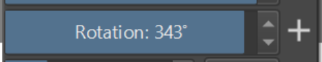
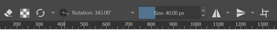
Continuing from the previous topic, this is how the angle slider is looking right now. It actually fits nicely with the other sliders, and the flip buttons are handy.
Screenshot:
Demo:
(Note: in the demo the snapping angle is 10 degrees, but then I reconsidered and changed it to the standard 15 degrees to be consistent with other angle selectors everywhere else and the default hotkey action increment).

This change depends on the scripting PR which hasn’t been merged yet.
5 Likes
Do you really need the 3 rotation buttons? Would there be a way to integrate those into the arrow buttons or the rotation widget? I am asking because if you use the slider, the width is quite short compared to the other sliders. I can also imagine you put the buttons below the slider so all buttons line out.
No, this is essentially the default look of this widget. It’s possible to hide the elements, but then it will become ever smaller compared to the other sliders. The minimal look is like the canvas angle control in the bottom status bar:
![]()
If you have something specific in mind, could you make a mock-up or take a screenshot of some existing widget that matches your desired look?
1 Like
@YRH I have been thinking, maybe something like this:

The rotation widget then shows the angle, but the sliders are about equal in size. The quick rotation buttons are moved to the bottom for 4 different angles (-90°, 0° +90°, +180°). But there’s still space for something else, so perhaps the angle widget could also move down to make the sliders equal in width.
I see, thanks for sharing the design.
OK, after considering it, I think I will stick with the current design for the following reasons:
- The first design had a big slider and no angle selector:
People seem to prefer the circular selector, and I agree that the slider bar is not that intuitive for the angles. It doesn’t support wrapping around and the direction may be confusing. - The widget must be a single row. Otherwise, it’s two separate widgets and I don’t think we want to use two slots just to manage the rotation. Sometimes less is more.
- Adding a widget with a slider and a selector circle requires adding a new widget class that will have to be maintained. I don’t think the difference is big enough to warrant that.
I hope others find these reasons compelling. I’ll be posting a PR in the late evening. Comment here if you feel strongly that we must do it differently. Thanks.
4 Likes
Understood, fair points. The main thing I am a bit hesitent on is that if I add the brush rotation to the toolbar permanently, it adds all these other buttons when in fact, the rotation widget or the slider would suffice
I would just use then to check my rotation values basically.
But that may also be solved by adding 3 versions of the buttons that you can add to the toolbar: the entire design (your original idea), the rotation widget (without a slider) and a rotation slider. Considering I have many sliders there, it would keep my UI cleaner. ![]()
1 Like
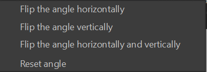
There are 2 other modes for the flip options: one just shows 1 drop down button with the options in a menu, and the other hides the button and makes the options accessible via right clicking the angle gauge.
For this case maybe the one with the dropdown button looks better.
1 Like
Thanks, I can try it out too.
I totally love it. Maybe the mirror option is better hidden. Imo just the rotation icon . It would be a good practical addition by default.
My personal choice would be this. Simple in terms of visual look, small, and useful
1 Like
OK, you know what guys? Let’s do a poll ![]() We can make a community decision!
We can make a community decision!
Note that all options have the right-click context menu available on the angle wheel:
Poll:
- A - flip buttons, depressed field
- B - menu button, depressed field
- C - context menu (right click), flat field
0
voters
Thank you for your vote. Naturally, feel free to provide other comments if you want.
PS. I wanted to make the poll auto-close, but apparently it doesn’t work. I’ll give it a week or so to collect feedback.
Good ideas.
- I wouldn’t use “Rotation” word but “Rot.” you save space, and for small monitors is better.
- I don´t know if sliders lenght can be configurable or compressed as the interface decrease. This would be useul again in small monitors for laptops.
I choose B, i think my vote has gone for A, because i click to see better the image ![]()
Oops, sorry, I didn’t know it would work like that ![]() And now I dare not edit the post, in case the votes would get erased…
And now I dare not edit the post, in case the votes would get erased…
I tried a variant without the “Rotation” label at all, but it seems it cannot get narrower than a certain width and the next slider to the right will be in a fixed position anyway. To get it optimized for smaller monitors would require looking at the top bar control itself, so maybe a task for another code change.
1 Like