As commented in this thread I did a merge request that adds new texture modes to the brush engine.
Now I open this thread so you can test the version in the MR and give feedback in a dedicated place. So if you can test/retest and leave your opinions here I would appreciate it. Thanks in advance.
Here are the test packages (thanks to @dkazakov for creating them). Remember to backup your settings before testing, just in case:
In short, the code in the MR does this (so these are the things that should be tested):
Adds the modes (obviously). The texture code is integrated to some extent with the masking brush so with the exception of the height modes (which make sense with a strength parameter), the lightness and the gradient modes, all other modes are the same.
Adds a new hard mix mode (Hard Mix Softer) which mimics the one used by Photoshop in the brush textures. As the name implies, this produces softer edges than photoshop’s normal hard mix and I think that for brushes looks better. This was added in a generic way so it is also available in the layer blending modes.
2
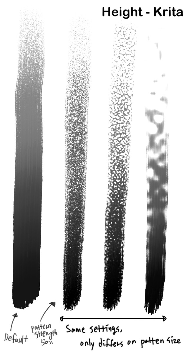
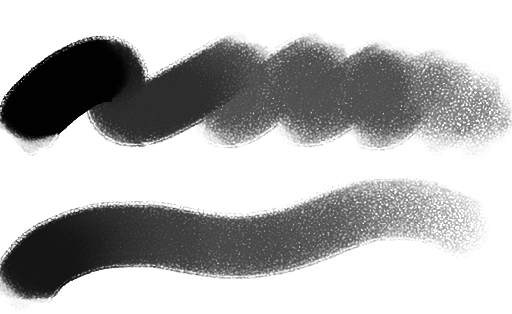
In Krita the texture tends to come out kinda looking digital, which means : sharp white dots on the stroke. I hope it comes out more natural and having the original texture untouched.
3
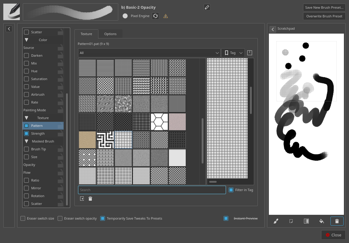
(This one is not so important honestly but just in case it’s not intended) In default, the pattern tends to get overwhelmed and become flat even from the low pressure all of a sudden in Krita. I needed to adjust the pattern strenght to 50.
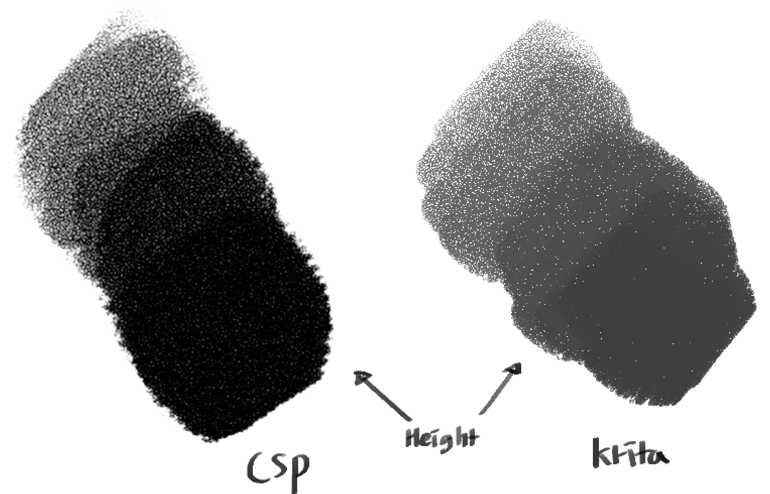
Can you test using the mode Height (Photoshop)? The Height mode on Krita is a custom one that I don’t think any other program has it. The Height (Photoshop) is similar to the one found on photoshop, but I can’t say how it compares to the one on CSP.
Well, the height modes implemented are different from the one in CSP: one is custom and the other emulates Photoshop’s height mode.
Maybe linear height is more similar to that mode in CSP.
Yes, that is done that way so that a bigger variety of effects can be achieved. You just adjust the strength with the slider or the curve to stablish a maximum.
If you can share the texture you use I can try to mimic that appearance. (Edit: Nevermind, I saw you posted it in the other thread).
Yes, I’ve tested every new blending modes before posting this.
The most similar result I have got, only for the darkning effect aside from the other texture aesthetics, was by using Lightness Map with the pen pressure on pattern strength reversed. But it had other problems and felt like I was doing it in a hackish way.
I’m waiting for Deif’s emulation since he mentioned he’ll try with the texture I posted.
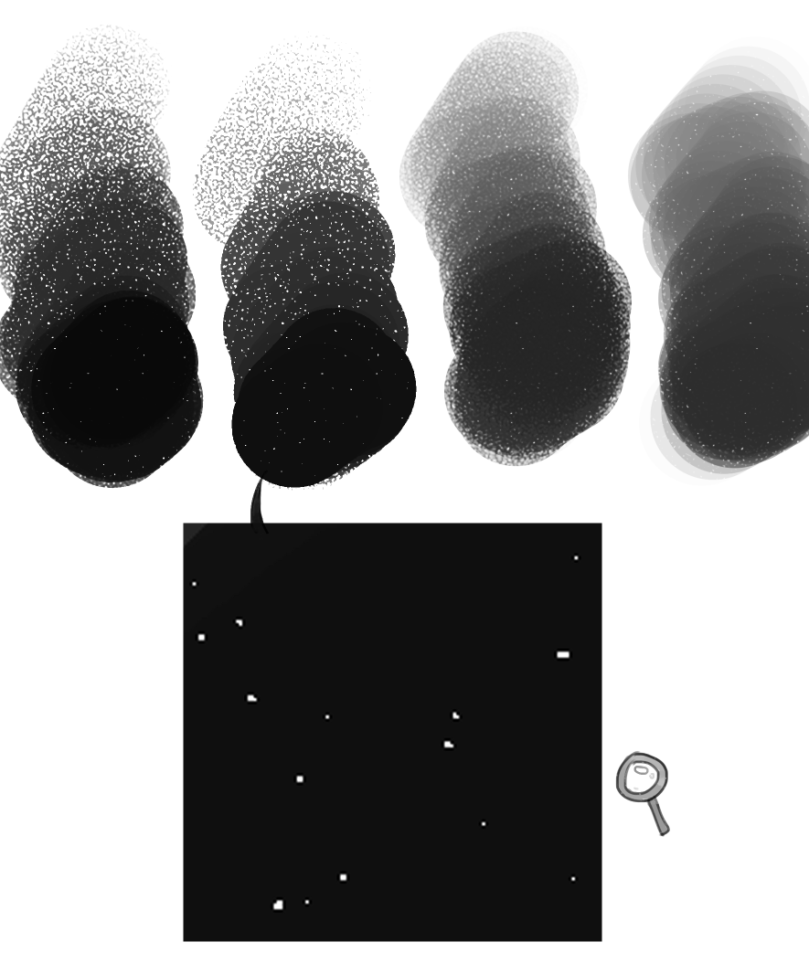
That ‘sharp white dots’ thing was a generic behavour across the blending modes actually. Burn, Hard Mix, Height, Linear Height, Overlay, Darken… Is this intended though?
Fair. Although this whole thing is not that big of a deal, I noticed that the strength number I need, to achieve the same amount of texture grain is very very different from mode to mode. Maybe roughly aligning the default amount at a same strength number would be helpful for the brush creation workflow? I assume it could be inevitable due to the mathematics but since you said ‘it’s done in that way’, it may not.
The first thing to note is the interaction between the ‘grayness’ of your brush tip and the ‘whiteness’ of the texture. Depending of the blend mode a gray Brush tip or/and a texture with white dots will result in those white dots.
Some blend modes will not provide a ‘full cover’ stroke when using a texture with white (or almost white) patterns, even with a total black Brush tip. To my knowledge these modes are: Subtract, Lightness Map, Gradient Map, Darken, Linear Burn and Hard Mix.
The others modes have the capability of get rid of those white dots either by using a high enough strength or a ‘darker’ brush tip.
Inevitable? Maybe not. Crippling? As far as I know, yes. Complex? Way too much.
It is hard to define what are the same level of texturing grain when we have way different blend results. I.e.: Hard Mix and Linear Height.
Some modes are not so straight forward to normalize the grain to strength relationship. The best example is Subtract and Height (Photoshop). Subtract at 100% is equal to Height (Photoshop) at 10%. This means when you put Subtract at 100%, the Height (Photoshop) should be at which strength to achieve the same grain texture?
The interaction between Brush tip and Texture also play a part in the grain to strength relationship, even in the same blend mode. I.e.: With the Height mode, a black Brush tip may be fully opaque with 50%, but if you change the Brush tip to a mid gray the full opacity will shift to 75%.
At first I suspected it was a problem with small patterns (2x2 - 32x32), but the cluster of DITH **** patterns are equally small but don’t have this outside square.
Then I turned my attention to the .pat textures, as all of them seem to have this problem. However,…
The following .png textures also have this problem. 25-dynamic-screentone-C.png and Abstract_lines.png
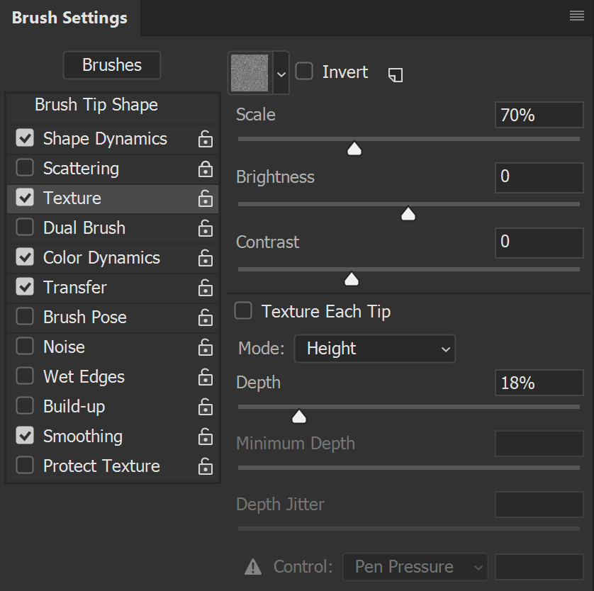
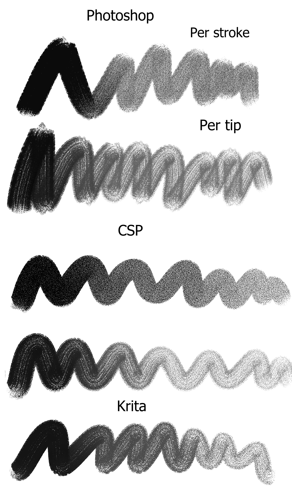
I believe that clip studio paint brush was converted from this photoshop brush. I think the main reason why it looks so different is because PS and CSP both has the texture applied “per-stroke” instead of “per-tip” like Krita does with textures by default. Like this example I made shows. Flow is disabled. This brush mainly gets that effect having the opacity pen-pressure enabled.
When “per tip” is enabled they all look very similar to the way it looks in krita. And you can see that every the program does height a little differently from each other
These new texturning modes are such a big improvement! And I’m glad the softer hard mix mode was added too! It does look a lot closer to how photoshop renders hard mix textures.
Question to everyone interested in brush texturing: should I add also as an option the way Photoshop uses the strength (depth)?
A comparison can be seen in the task. In each mode section the top stroke uses photoshop mode and the middle one krita’s.
Your task description and the work you have done are amazing, so first: thank you a lot for what you do here.
What do you mean by “the way Photoshop uses it”? Using the “PS way” instead of a better solution that would just not be “exactly” like PS? (I think you’re talking about the factor being 10 instead of 12,5?)
No no, the height modes are pretty much the same, I’m talking about the other modes. In each blend mode section of the task there are 3 ways how the strength could be applied. The first is how ps does it and the second how krita does it. I’m asking if I should include both ways of applying the texture instead of just the krita one.