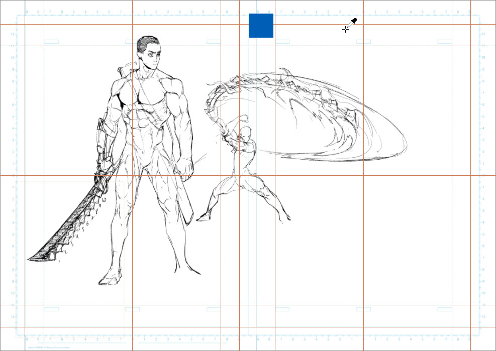
I love Krita so much but since I love drawing manga so much I have to sketch and line my drawings in Krita and then use Medibang for manga screentones and effects.It’s so tedious.I wish for manga screen tones and effects in the next update ![]()
Hi
Krita already have tones effects…
Maybe just need some additional patterns?
Grum999
1 Like
There are screentone brushes,
Also you can make your screentone as @Grum999 link, [you can use a gray tone palette for that]
you can also download some screentone texture.
Here is a link to a previous person asking for screen tone brushes;
Krita also have a couple default manga style brushes [ sparkles, bokeh, heart shapes]
I’ll add a couple more tools.
Here is Rogudator’s Speech Bubble Generator;
My speech bubble set;
for inking pens good ones can be found in Krita-artists brush section . I suggest rakurris, schordinger cat’s, concept and illustration [illustration set] , lilly mist set [for the manga effects]
Here is a another helpful vector set [can be useful for additional toning]
If you are going to do the halftoning effect you can use my gray tone palette;
Edit: I added LillyMist brushes in the suggestion.
8 Likes
Krita now features a very decent screentone generator thanks to the precious contribution of @Deif_Lou.
And I also draw manga but used Krita as my main program for it.
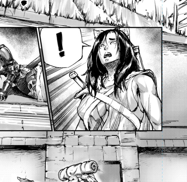
Check these few pages for instance :
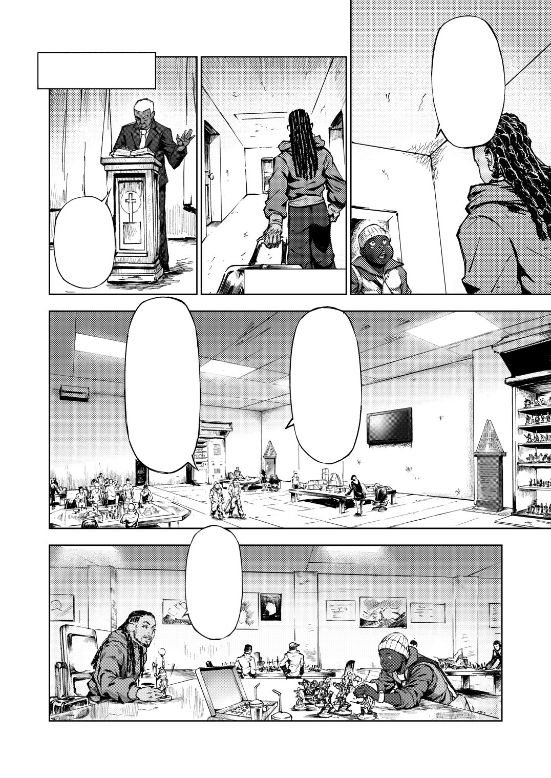
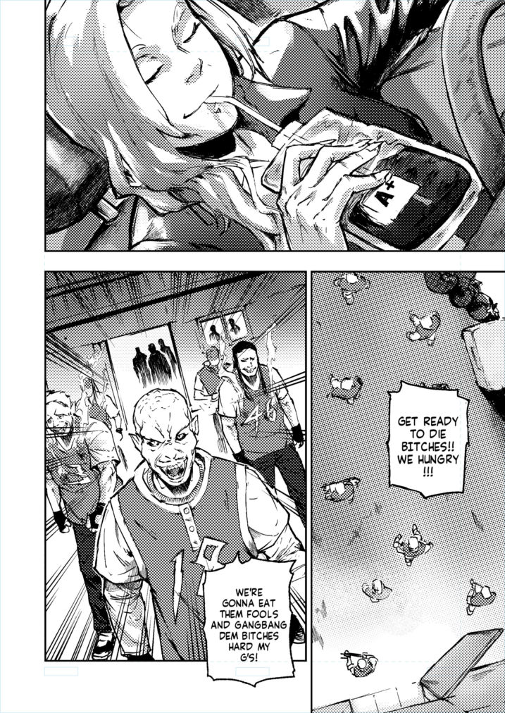

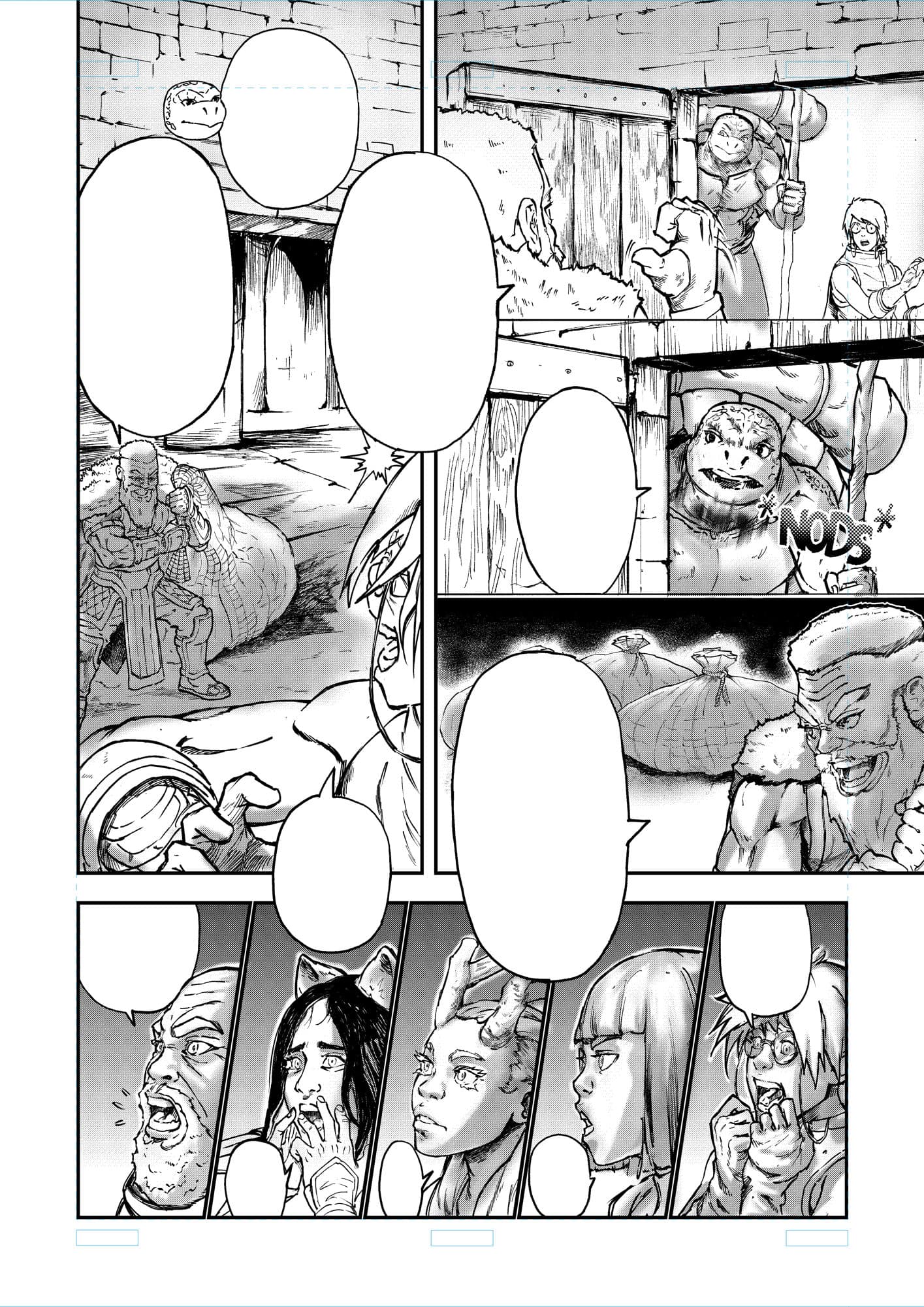
Should you need anything specific to help you get comfortable with drawing manga for production in Krita, please let me know and I’ll help to the best of my abilities.
11 Likes
Hey, these panels look really great!
I probably won’t draw a manga any time soon, but for research purposes ![]() – From the file names I see these are A4 @ 500 dpi, is that right? Screentones are rather sensitive to resizing, so I was wondering what the best practices are for using them with digital reading in mind (rather than preparing for print).
– From the file names I see these are A4 @ 500 dpi, is that right? Screentones are rather sensitive to resizing, so I was wondering what the best practices are for using them with digital reading in mind (rather than preparing for print).
Not all of them are A4 @500ppi.
The first one is a downscaled version of A4 @300 ppi.
Now, about screentone work with digital publishing in mind, there are two cases.
CASE A : gray tones with solid color painting
Paint the tone in greyscale and publish as is, without generating the screentone from it.
CASE B : screentone adapted for screens
Basic rule is to go with 300 ppi and 600 ppi ideally for your manga manuscript and then
downscale to a level that makes the tone adapted for screens( by avoiding moirées).
First use the halftone filter and pick the most suitable of the following options for you.
B-1 ) STARTING WITH ANTI-ALIASED DOT PATTERN
Under the “Intensity” mode, generate a screentone witth the following options :
- (pattern : dots, shape : round, interpolation : sinusoidal, equalization : template based)
- frequency : 50 lines per inch(300 ppi document) or 60-80 lines per inch(600 ppi document)
- check on the “align to pixel grid” option(1 cell vertically and horizontally)
- keep the rotation angle at 45°
- brightness and contrast should be 50% each
- opacity should be 100% for both foreground and background colors
- hardness should be something like 70-80%
Click OK.
Then scale down the whole image by 10% decrements( possible
values in percentage are : 90, 80, 70, 60, 50, 40, 30, 20, 10 ).
You may have to switch between scale filter algorithms, but usually, the
“bicubic” method is fine.
Proceed with trial and error until you find the perfect coefficient.
If done well, the screentone should be similar to this as you
zoom in :
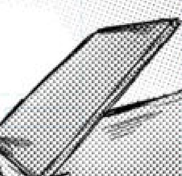
or this
or this
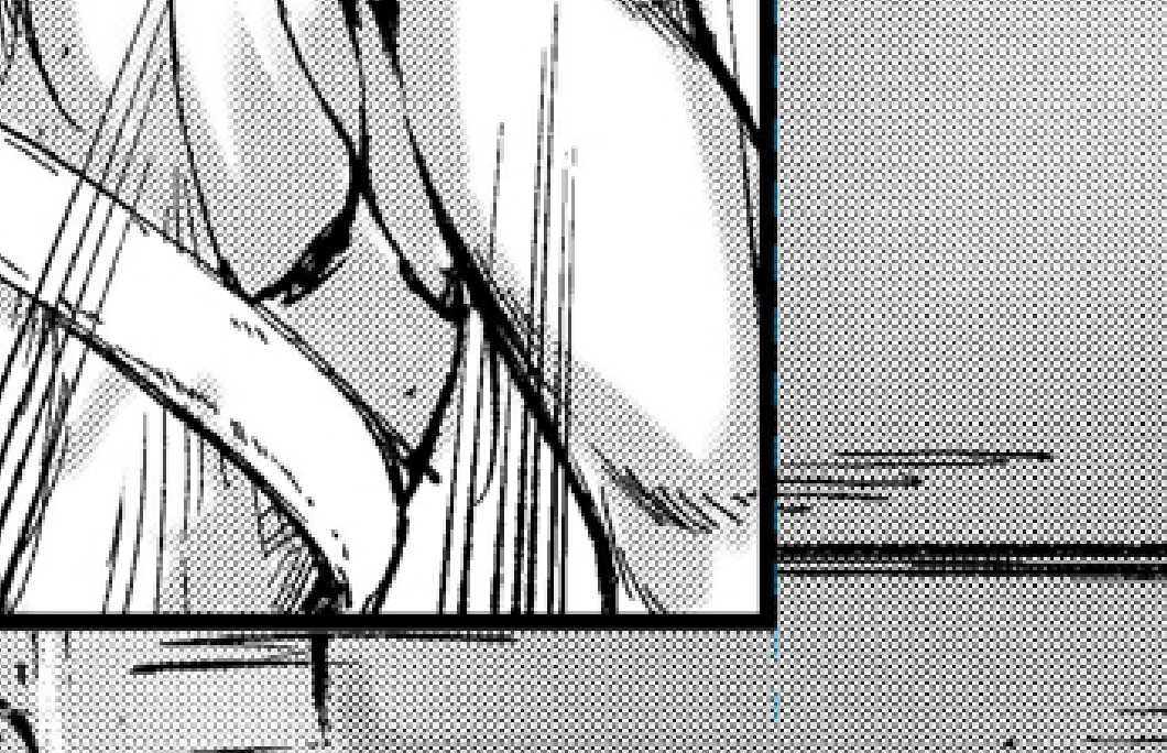
And when you zoom out, it blends to appear like gray color painting, with a
kind of texture.
B-2 ) STARTING WITH ALIASED DOT PATTERN
For this one you follow the same options as in B-1) with the exception of hardness
which should be 100% this time.
Then you make the same trial and error to identify the perfect downscale setting for your generated screentone.
Note : web manuscript export should consist of images not too heavy.
Therefore, be it for the width or the height of the image, try to stick within
the range [800-2500 pixels], or else your manuscript size will be heavy.
7 Likes
Thank you, that’s very helpful. I guess I’ll bookmark it for future reference! ![]()
1 Like
how do you draw backgrounds?
Important note which I forgot.
Before performing the downscale operation, use the exported image of the manuscript( all layers merged into one ). It will make the operation more efficient.
You just do it manually by sketching using perspective, then inking ontop.
Some other ways involve doing “Line and Tone conversion” of 3D models or
real life photos, and then inking on the result to add/modify details to your backgrounds.
1 Like
Hello, do you mind if I ask how, you achieve a full spread of 2 pages to work on in Krita? For Manga specifically. Do you just double the width and work from there or do you have another way of working on 2 split pages. I attempted to work with the comic Manager but it doesn’t allow you to work with a full spread of 2 pages.
Any advice would be much appreciated. Your input has already been very helpful. Thank you!
Hello, do you mind if I ask how, you achieve a full spread of 2 pages to work on in Krita? For Manga specifically. Do you just double the width and work from there or do you have another way of working on 2 split pages. I attempted to work with the comic Manager but it doesn’t allow you to work with a full spread of 2 pages.
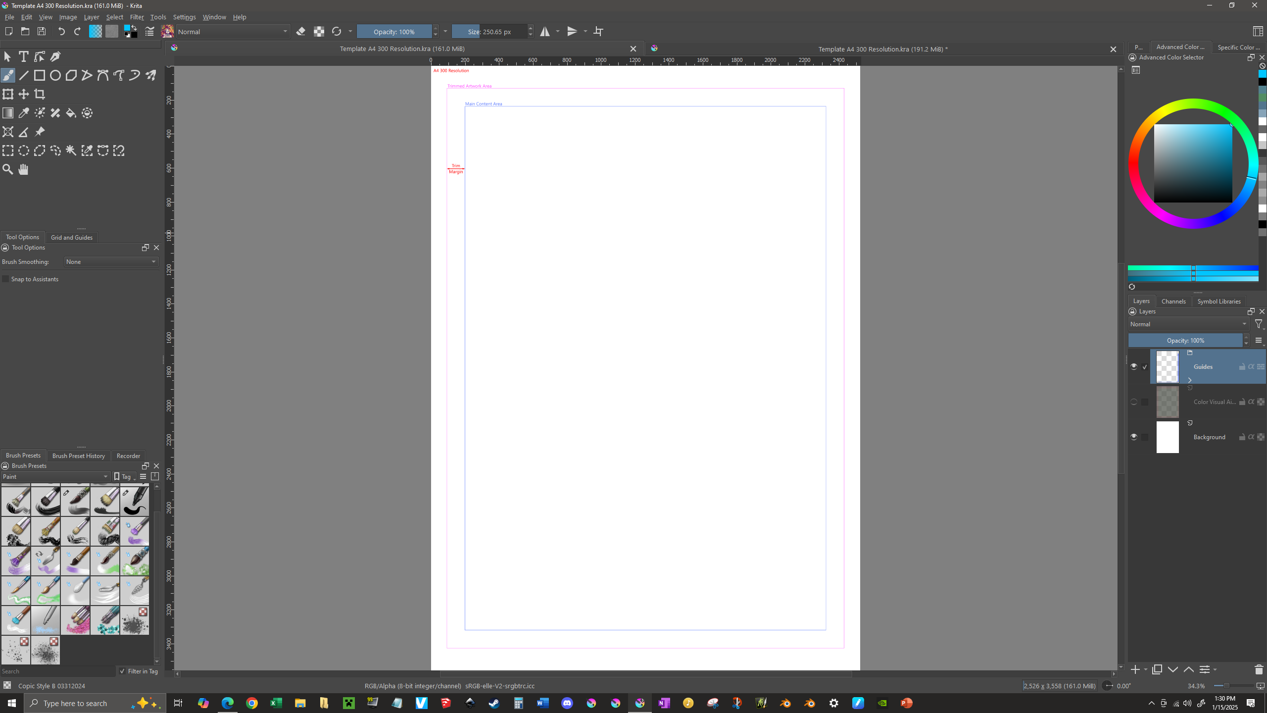
In case novames00 doesn’t come back around, I figured I’d chime in. I mostly do western style comics, but I figure it can’t be much different. So, I’d create a canvas specifically for a double page spread. I assume you’re already using a template for the single pages. To set up your new canvas, do the following:
1 - Open your single page template.
2 - Select all (Select → Select All) and then chose the Crop Tool (by having first selected all, Krita will auto-set the crop to your pages dimensions). Select the Crop Tools rig at it’s right-center node and drag inward to the left, so that it meets with your outermost trimline (this line should be the absolute limit the printer might allow into the image). Finalize the crop, to lop off the end.
3 - Go to Image → Resize Canvas. Ensure the small chain symbol is broken, by clicking on it, so when you change the width, it won’t change the height with it. No set the Width to 200% (be sure that it’s % and pixels or other measurement). Then click on the left-center button on the anchor grid, to ensure the canvas expands from that point out towards the right. Click OK to set the changes.
4 - Duplicate your guides layer and then select the Transform Tool to select that layer. On the Tools Option panel, there’s a grid similar to anchor grid from step four. This time select the right-center button of the grid. Right click over the Transformation rig on your canvas and select Mirror Horizontally. Finalize the transformation.
If you followed these steps you should have gone from something like this…
…to something like this:
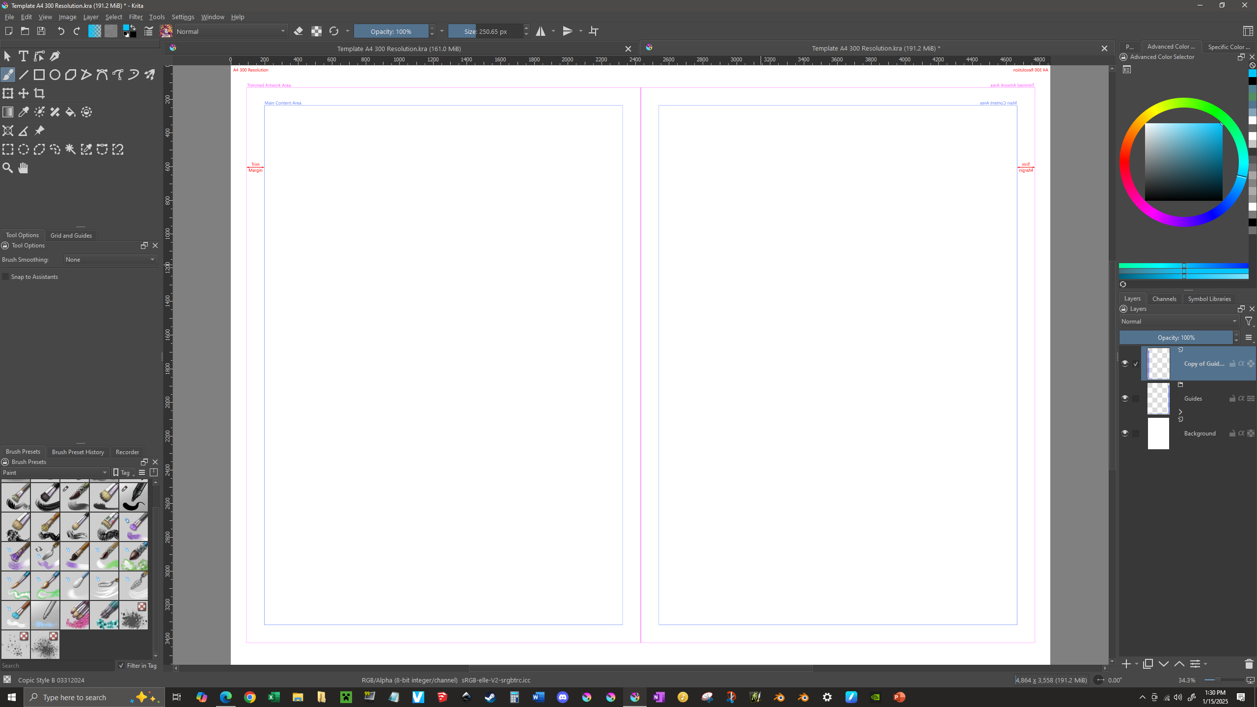
When you’re working, keep in mind anything within the two gaps at the center is content that could be difficult to see in print (because it would be either pressed towards, or lost completely within, the binding). So, be sure anything visually important (speech bubbles, for example) remains within the main content areas.
4 Likes
In my case, I have two templates which I use to draw my manga pages,
one for single spread pages and the other for double spread pages.
They were originally designed using Adobe Illustrator however.
After the design, I exported the template to bitmaps.
And to finalize them as “krita-ready files”, I opened the
bitmaps in Krita, added a few software-specific guides (check ref1)
and then saved the templates as kra files.
ref1
Since the double spread needs to match a standard print format as well,
I used the A3 size. In other words, you have A4 for the single spread
page, and A3 for the double spread page.
Because of this, there’s a bit more space on the outer margins
of the A3 document.
A4 document
A3 document
1 Like